Read the statement by Michael Teeuw here.
MMM-Scrobbler CSS
-
if you want the meta text centered you need to add
.right > .meta {
    /* margin-left: 16px; */
    margin: auto 16px;
}
to your css.
-
Works like a dream with just a few “nuances” such as if you have it on the right side of the screen with the meta data to the right of the image, the meta data disappears off the screen and I suspect the same with the left. Otherwise its really good … thanks so mch!!!
-
@PtrBld said in MMM-Scrobbler CSS:
if you want the meta text centered you need to add
.right > .meta {
/* margin-left: 16px; */
margin: auto 16px;
}to your css.
It’s a good idea to add the module’s name to this rule so that it does not accidentally affect another module that coincidentally happens to use the same class names. Something like this:
.module.MMM-Scrobbler .right > .meta { /* margin-left: 16px; */ margin: auto 16px; } -
Thanks @PtrBld for you lightning quick turn around of this one and to @j-e-f-f for the extra advice, much appreciated
-
@spwood100 how did you get the “Spotify Music” header at the top of it?
-
@solelo said in MMM-Scrobbler CSS:
@spwood100 how did you get the “Spotify Music” header at the top of it?
Please try this:
{ module: 'MMM-Scrobbler', header: 'Spotify Music', // <<<<<< position: 'top_right', config: { username: 'Last.fm username', apikey: 'Last.fm api key', //time interval to search for new song (every 15 seconds) updateInterval: 15 * 1000, //how often should we try to retrieve a song if not listening delayCount: 5, //time interval to search for new song if the 5 times not listening is received. //set this to the same number as updateInterval to ignore this option delayInterval: 120*1000, animationSpeed: 1000, showAlbumArt: true, showMetaData: true, //Determines the position of the meta text. Possible values: top, bottom, left, right alignment: "bottom", } } -
@yawns that worked perfect. Now it’s blocking the bottom MyCommute module, any ideas how to get that fixed?

Screen Shot 2018-07-04 at 12.18.22 PM 🌚 -
@SoleLo , add the following into the module config
header:
So for example
module: ‘MMM-Scrobbler’,
position: 'top_right',
header: 'insert your text here'
  config: {
Should work, let me know if it doesnt
-
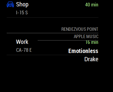
@spwood100 I got it to work but it shows up over the MyCommute module…
-
@SoleLo , that would be something to do with the relative sizes of the modules. You would probably need to play about with some custom css to get these to not overlap, something I am still struggling with on my screen from time to time.
Some excellent posts in the forum on css though:
You could also post in the CSS help section?
https://forum.magicmirror.builders/category/31/development
Cheers
