Read the statement by Michael Teeuw here.
MMM-DWD-WarnWeather - Wetterwarnungen
-
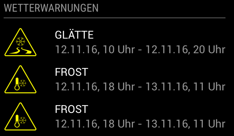
So that’s how it looks now.
-
Thanks! Great job
-
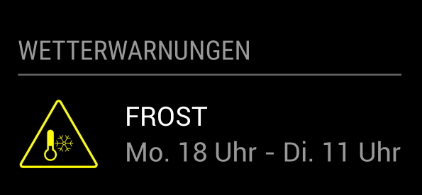
I made some small changes to the formatting of the date. It now looks like this:
-
Nice work and thanks for shareing!
Does the german wheater forecast provide an API? Are those warnings for a special region or a general broadcast for your state (Bundesland)?
I think I have look if the Swiss guys does too, usually they provide alot of datas (ch opendata) - Need those warnings too, especially for snow/icy conditions :).
-
Hey @tajno,
they don’t really provide an API. I did a bit of reverse engineering on their website and found that you can get a JSON file with all the warnings for Germany for a specific time.
This JSON contains warnings for all regions (Landkreise) of Germany.
If you find an API for Switzerland I can help you to implement it. -
@LukeCodewalker Very interesting module, will you add this to the wiki as well?
Also why did you make a custom header? Wouldn’t it be better to use the default header functionality?
-
@Jopyth Thank you. Yes I will add it.
Sure I will fix it soon. -
@weedorbeat good idea. I’ll put that on my list.
-
@weedorbeat hey,
do you have an idea, how the warnings should show for which region they are? Just making a header for each region would not be very nice in my opinion. My first idea was to put the region in brackets behind the warning. But i definitely want to keep the appearance of the module very simple/small. Another thing I want to implement is the starting altitude of the warning (like “Schneefall ab 400m”). But there i have the same problem: I don’t had an idea how to display it with keeping the module looking nice. -
@LukeCodewalker to display different things in a module, i implemented kind of caroussels in a couple of my modules to show only one part per time interval e.g. 20 seconds. this will result in a small display but can handle a lot of informations. in the develop branch is a new feature to extend the header defined by the user with custom values. you could add there the region.
-
Ok now it looks like this:
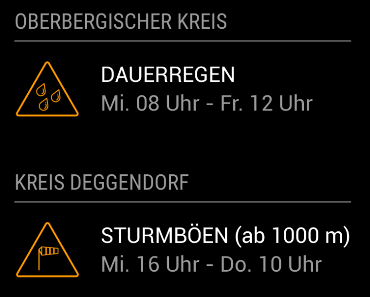
It’s using the default header functionality now.
To have more than one region you have to put the module two times in your config like{ module: 'MMM-DWD-WarnWeather', position: 'bottom_left', header: 'Oberbergischer Kreis', config: { region: 'Oberbergischer Kreis', changeColor: true, interval: 10*60*1000 } }, { module: 'MMM-DWD-WarnWeather', position: 'bottom_left', header: 'Kreis Deggendorf', config: { region: 'Kreis Deggendorf', changeColor: true, interval: 10*60*1000 } } -
Hey,
nice work, great addition to my setup, thank you!
I currently have two problems.
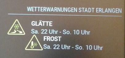
When there are two notifications, the second one is indented (can’t make a screenshot right now, sorry).
And on Firefox (I usually open the mm on my pc, too) the symbols are really, really large: .sprite_sturm has a size of 256x256px, this could be a little bit smaller… I guess Firefox handles the css different, on the mirror they have the right size.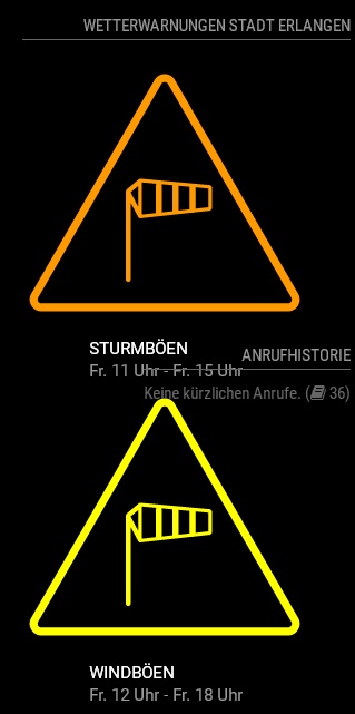
-
@Matthes0815 Thank you.
I will have a look over that, when I got some time. -
You’re welcome… take your time, it’s not really a problem.
Here now a photo of the indented warnings:
-
@LukeCodewalker
Great module, thanks a lot!Having the same issue on Firefox with the icon size as Matthes0815.
Also the warnings are shown twice.
I´ve setup the config to poll DWD warnings for my region (Landkreis), any idea why this happens?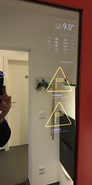
-
Ok. Firefox bug should be fixed now.
Maybe you see the warning twice because DWD is having it twice on their website?
For further issues please use the new Trubleshooting thread. Thank you. -
@Matthes0815 said in MMM-DWD-WarnWeather - Wetterwarnungen:
You’re welcome… take your time, it’s not really a problem.
Here now a photo of the indented warnings:

Are you using the latest version of this module? I could not reproduce this bug.
Are you
-
It was the latest version when I took the photo. Sadly the weather here is nice and friendly, no warnings at the moment…
Where are the autumn storms when you need them? -
@LukeCodewalker Many thanks for the Firefox fix, awesome.
Now everything is displayed correctly.Regarding the duplicate warnings, you were right, they were displayed twice on the DWD website.
One for the whole region and another one for altitudes above 600m.Great work :-)
-
Hi,
no data is displayed with me. It remains in the state “Warnungen werden geladen…” Region was “Kreis Lippe”
Any ideas or suggestions?
Mark
Hello! It looks like you're interested in this conversation, but you don't have an account yet.
Getting fed up of having to scroll through the same posts each visit? When you register for an account, you'll always come back to exactly where you were before, and choose to be notified of new replies (either via email, or push notification). You'll also be able to save bookmarks and upvote posts to show your appreciation to other community members.
With your input, this post could be even better 💗
Register Login