Read the statement by Michael Teeuw here.
Layout problem
-
Hi,
Finally got MM to work. I use it on the official 7" Raspberry Pi Touchscreen. But I do have problems getting a nice layout. What I want is to have the time and current weather side-by-side. I have searched but did not find a new module containing both. Right now it looks like this:
Total mess lol. But if I manage to get them side-by-side it will look OK. How do I do this? I am kind of noobish so please overexplain!
Best regards
Fiskaren*edit photo did not show, here is a link: http://imgur.com/a/sicJ0
-
@fiskaren in what regions have you placed your modules?
I would suggest regionstop_leftandtop_rightfor the clock and weather.And you probably have to change the font sizes to make it fit.
Add this in to your custom.css file.xsmall { font-size: 15px; line-height: 20px; } .small { font-size: 20px; line-height: 25px; } .medium { font-size: 30px; line-height: 35px; } .large { font-size: 65px; line-height: 65px; } .xlarge { font-size: 75px; line-height: 75px; letter-spacing: -3px; }Then change the font-size until you have the look you want.
-
@broberg Awesome, will try that soon after my trip to the store for a PIR-sensor.
The clock is at
top_barand right now the weather is attop_left. When both are placed attop_barthe clock are one row over the weather. Will that auto-adjust when changing the font? -
@fiskaren no, if they are in the same region they will always stock on top of each other.
use top_left for clock and top_right for weather and then place the other modules in the upper/lower third regions and bottom regions.
-
@broberg Well I am not really happy with the results right now. I have changed the size pretty much, but they still merge into eachother. And I realize I have to change the size even more if I dont want them to do that. And since that changes the font on every module it will look crazy and also unreadable.
Here is a picture of how it looks right now:
http://imgur.com/a/t8JDjIs it possible to force the modules some pixels out? Because if so I could put them closer to the edges and that would probably solve the problem.
The last solution could be to remove wind-speed. But it’s windy where I live and I would very much like to know the wind speed!
-
@fiskaren custom.css
body { margin: 0px; height: 100%; width: 100%; } -
Do what strawberry wrote, it will give you more space on the screen.
also
This should change the size of the fonts in the top two modules only
.currentweather { font-size: 50%; } .clock { font-size: 50%; } -
@strawberry-3.141 said in Layout problem:
@fiskaren custom.css
body { margin: 0px; height: 100%; width: 100%; }@broberg said in Layout problem:
Do what strawberry wrote, it will give you more space on the screen.
also
This should change the size of the fonts in the top two modules only
.currentweather {
font-size: 50%;
}

.clock {
font-size: 50%;
}
Awesome. Thank you both. It looks perfect now! :D
-
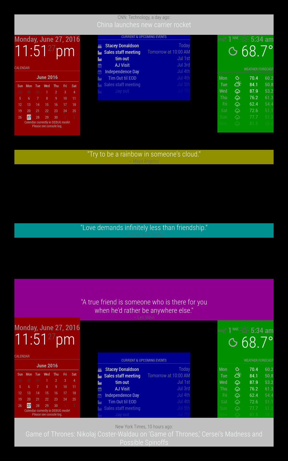
You might find this useful, I thought it was awesome when I saw it:
https://forum.magicmirror.builders/topic/286/regions
top_bar and bottom_bar are light gray
top_left and bottom_left are red
top_center and bottom_center are blue
top_right and bottom_right are green
upper_third is yellow
middle_center is cyan
lower_third is magentaAll these regions will resize as needed.

Hello! It looks like you're interested in this conversation, but you don't have an account yet.
Getting fed up of having to scroll through the same posts each visit? When you register for an account, you'll always come back to exactly where you were before, and choose to be notified of new replies (either via email, or push notification). You'll also be able to save bookmarks and upvote posts to show your appreciation to other community members.
With your input, this post could be even better 💗
Register Login