Read the statement by Michael Teeuw here.
MMM-NOAA - Another Weather Module
-
Description:
Built with love by me, @Snille, with help from @Mykle1
Didn’t plan on releasing this but due to requests here it is…
MMM-NOAA - another weather module :)
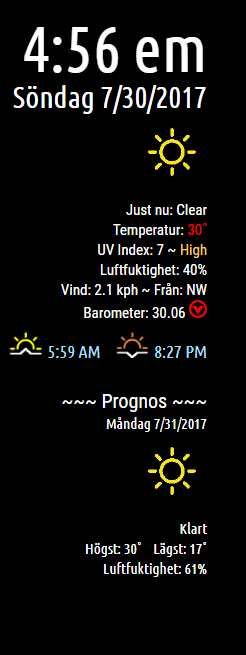
Currently available in English, Swedish and German flavors… [Please PM me if you’d be interested in making any other translation files for this ].
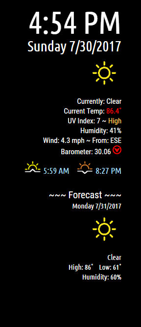
Time/Date
Current weather
current condition
current temp [if above certain temp number turns red]
UV Index [using the UV Index color codes]
Humidity [if above certain % changes number color]
Wind and direction
Barometer [Shows number plus if rising, falling or steady]Sunrise/Sunset times
Forecast
Rotates through 10 day forecast [including today]
Expected condition
with high/low temps
expected humidityPlease follow Readme on Github!
Screenshots:
English
Swedish

Version 1.0.0
Download:
[card:cowboysdude/MMM-NOAA]
-
-
-
Nah! You two guys are the real geniuses. I’m just an idea guy.
-
@cowboysdude How can it support another language such as thai,korea,japaness language
-
de.json{ "GATHERING_WEATHER_STUFF": "Empfange Wetterdaten...", "CURRENTLY": "Aktuell", "CURRENT_TEMP": "Temperatur", "UV_INDEX": "UV Index", "WIND": "Wind", "FROM": "Von", "BAROMETER": "Barometer", "FORECAST": "Prognose", "MONDAY": "Montag", "TUESDAY": "Dienstag", "WEDNESDAY": "Mittwoch", "THURSDAY": "Donnerstag", "FRIDAY": "Freitag", "SATURDAY": "Samstag", "SUNDAY": "Sonntag", "OVERCAST": "Bedeckt", "CLOUDY": "Bewölkt", "RAIN": "Regen", "CLEAR": "Heiter", "PARTLY_CLOUDY": "Leicht bewölkt", "HIGH": "Maximum", "LOW": "Minimum", "HUMIDITY": "Luftfeuchtigkeit", "SAFE": "Sicher", "MODERATE": "Moderat", "SNOW_SHOWERS": "Schneeregen", "VERY_HIGH": "Sehr hoch", "EXTREME": "Extrem", "SUNSET": "Sonnenuntergang", "SUNRISE": "Sonnenaufgang" } -
@yawns said in MMM-NOAA - Another Weather Module:
“Aktuell”,
Thank you @yawns !!!
Thanks to @barnosch and @Michii_M !!!
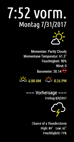
-
@nobita just need to create a translation file in json format. I can help you with that if you wish :)
-
@yawns Thanks so much
-
UPDATE
Added 2 new config options:
- Show or hide the clock at the top
- To show date format in D/M/YYYY or M/D/YYYY
See the README on Github
Download:
[card:cowboysdude/MMM-NOAA]
-
Hi what a very great module ! i’m interesting in making a french translation…
-
@Fonfon THANK YOU!
Here is the file if you could Please and Thank you.
"GATHERING WEATHER STUFF": "Samlar väderinformation...", "Currently: ": "Just nu: ", "Current Temp: ": "Temperatur: ", "UV Index ": "UV Index ", "Wind: ": "Vind: ", "From: ": "Från: ", "Barometer: ": "Barometer ", "~~~ Forecast ~~~<br/>": "~~~ Prognos ~~~<br/>", "Monday": "Måndag", "Tuesday": "Tisdag", "Wednesday": "Onsdag", "Thursday": "Torsdag", "Friday": "Fredag", "Saturday": "Lördag", "Sunday": "Söndag", "Overcast": "Mulet", "Cloudy": "Molnigt", "Rain": "Regn", "Clear": "Klart", "Partly Cloudy": "Delvis molnigt", "High: ": "Högst: ", "Low: ": "Lägst: ", "Humidity: ": "Luftfuktighet: ", "Safe": "Säkert", "Moderate": "Medel", "Snow showers": "Snöbyar", "Very High": "Mycket Högt", "Extreme": "Extremt", "Sunset": "Solnedgång", "Sunrise": "Soluppgång", "hours": "hours", "minutes": "minutes", "Amount of Daylight": "Amount of Daylight" -
Description:
Update:
-Added Spanish translation
-Added ability to not show clock using config option - See README
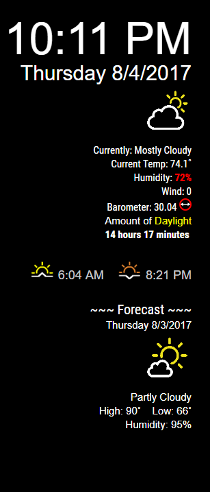
- Added when humidity goes above 70% it shows in red
-Added Amount of Daylight that day [example 14 hours 12 minutes]Currently available in English, Swedish, German and NOW Spanish flavors … [Please PM me if you’d be interested in making any other translation files for this ].
Please follow Readme on Github!
Screenshots:
English
Version 1.0.1
Download:
[card:cowboysdude/MMM-NOAA]
-
I have noticed that some weather conditions still are in English… there was no way I could get them all for translation.
If you get one that is NOT in your the translation file please note it so it can be added!!
Huge Thanks!
-
@cowboysdude said in MMM-NOAA - Another Weather Module:
“GATHERING WEATHER STUFF”: “Samlar väderinformation…”,
"Currently: ": "Just nu: ",
"Current Temp: ": "Temperatur: ",
"UV Index ": "UV Index ",
"Wind: ": "Vind: ",
"From: ": "Från: ",
"Barometer: ": "Barometer ",
“~~~ Forecast ~
": "
”,
“Monday”: “Måndag”,
“Tuesday”: “Tisdag”,
“Wednesday”: “Onsdag”,
“Thursday”: “Torsdag”,
“Friday”: “Fredag”,
“Saturday”: “Lördag”,
“Sunday”: “Söndag”,
“Overcast”: “Mulet”,
“Cloudy”: “Molnigt”,
“Rain”: “Regn”,
“Clear”: “Klart”,
“Partly Cloudy”: “Delvis molnigt”,
"High: ": "Högst: ",
"Low: ": "Lägst: ",
"Humidity: ": "Luftfuktighet: ",
“Safe”: “Säkert”,
“Moderate”: “Medel”,
“Snow showers”: “Snöbyar”,
“Very High”: “Mycket Högt”,
“Extreme”: “Extremt”,
“Sunset”: “Solnedgång”,
“Sunrise”: “Soluppgång”,
“hours”: “hours”,
“minutes”: “minutes”,
“Amount of Daylight”: “Amount of Daylight”Hi, here the french translation:
"GATHERING WEATHER STUFF": "Info météo",
  "Currently: ": "Actuellement: ",
  "Current Temp: ": "Température: ",
  "UV Index ": "Index UV  ",
  "Wind: ": "Vent: ",
  "From: ": "de: ",
  "Barometer: ": "Baromètre ",
  "~~~ Forecast ~~~<br />": "~~~ Prévision ~~~<br />",
  "Monday": "Lundi",
  "Tuesday": "Mardi",
  "Wednesday": "Mercredi",
  "Thursday": "jeudi",
  "Friday": "Vendredi",
  "Saturday": "Samedi",
  "Sunday": "Dimanche",
  "Overcast": "Couvert",
  "Cloudy": "Nuageux",
  "Rain": "Pluvieux",
  "Clear": "Clair",
  "Partly Cloudy": "Partiellement nuageux",
  "High: ": "Haute: ",
  "Low: ": "Basse: ",
  "Humidity: ": "Humidité: ",
  "Safe": "Sûr",
  "Moderate": "Modéré",
  "Snow showers": "Averses de neige",
  "Very High": "Tres élevée",
  "Extreme": "Extrême",
  "Sunset": "Coucher de soleil",
  "Sunrise": "Levée de soleil",
  "hours": "Heures",
  "minutes": "Minutes",
  "Amount of Daylight": "Lumière du jour"
when you are ok tell me. for control.;)
-
@Fonfon THANK YOU so much!!
Added and working… :)
-
@cowboysdude with pleasure ;)
-
Had to make a minor adjustment on my end… please check the date and make sure it’s showing correctly :) [Right date… ie 8/9/2017 please make sure the day number is correct]
-
You mean I have to live tomorrow all over again? ;^)
-
@Mykle1 Ground Hog day
Hello! It looks like you're interested in this conversation, but you don't have an account yet.
Getting fed up of having to scroll through the same posts each visit? When you register for an account, you'll always come back to exactly where you were before, and choose to be notified of new replies (either via email, or push notification). You'll also be able to save bookmarks and upvote posts to show your appreciation to other community members.
With your input, this post could be even better 💗
Register Login