Read the statement by Michael Teeuw here.
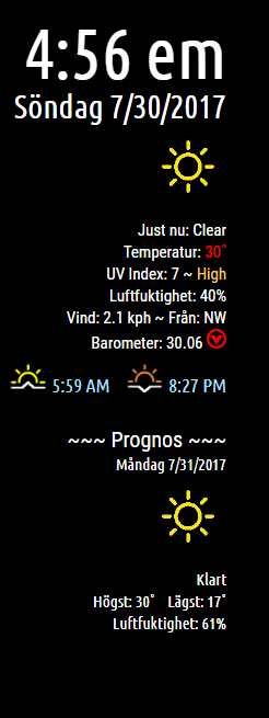
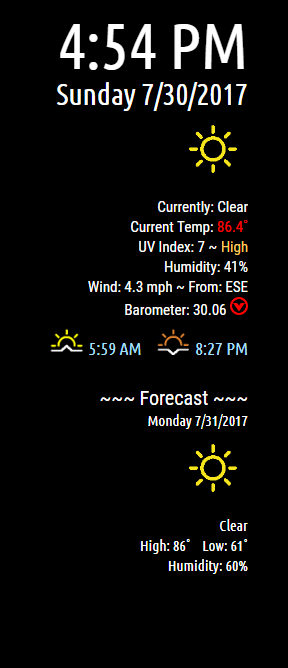
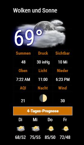
MMM-NOAA - Another Weather Module

-
Dude! Cowboys season… :face_with_stuck-out_tongue_closed_eyes:
-
-
-
@cowboysdude : thanks a lot ;) Football first
-
I made it bigger by changing the font and image values in the css file I use. WHich, I use the CSS4 option.
-
Hello,
has someone tested the NOAA3 module with accuweather provider?
I think something is wrong to identify the city with lan and long.
With this config I don’t see any weather information from the module, only air quality:{ disabled: false, module: 'MMM-NOAA3', position: 'top_right', config: { provider: "accuweather", apiKey: "xxxxxxxxxxxx", airKey: "yyyyyyyyy", css: "NOAA3", // THIS MUST CONTAIN A CSS STYLE NAME userlat: "45.483219", //MUST HAVE BOTH userlon: "9.203567" //MUST HAVE BOTH } },In the aw.js file I find this request:
url = "http://dataservice.accuweather.com/currentconditions/v1/"+zip+"?apikey="+this.config.apiKey+"&details=true";I think this request doesn’t pass the correct “location key” (the zip value).
Infact if I manually force a “location key” the “current conditions” start to work:url = "http://dataservice.accuweather.com/currentconditions/v1/214046?apikey="+this.config.apiKey+"&language="+config.language+"-it&details=true";This instead doesn’t work for the forecast, if I force the “location key” the module doesn’t show the “four day forecast”
url: "http://dataservice.accuweather.com/forecasts/v1/daily/5day/214046?apikey="+this.config.apiKey+"&language="+config.language+
"-us&details=true&metric=false",
I found also another problem with the language because in the request is passed the right language but not the right region, it remains “us”, so the module doesn’t show any value :
&language="+config.language+"-us&details=true&metric=false"Can someone resolve the problem?
I’m not so able with js :-)
Thanks -
@piluke I will look into it. However the one problem AW provider does have is at times when you’re just starting the module you have to reload it to get the 4 day forecast…why, I’m not really sure it’s just how it’s been working.
I’ve made some changes but a few more need to be made here’s an example of the update:
-
@piluke the updated aw.js is uploaded to git hub.
Do a git pull and the config has changed to include your zip…
REMEMBER YOU MAY HAVE TO RELOAD IT TO GET THE BOTTOM FORECAST…tis an accuweather issue…{ disabled: false, module: 'MMM-NOAA3', position: 'top_right', config: { provider: "accuweather", apiKey: "xxxxxxxxxxxx", airKey: "yyyyyyyyy", css: "NOAA3", userlat: "45.483219", userlon: "9.203567" zip: "11111" //YOUR ZIPCODE } },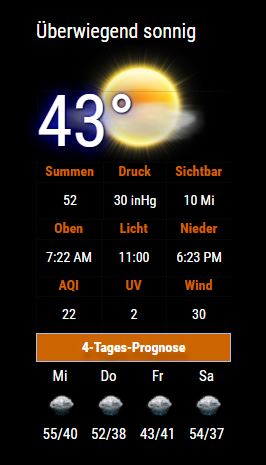
-
Still working on openweather api as time permits…it’s a complete train wreck LOL
Something has changed…but I am working to fix it.
-
@cowboysdude many many thanks for your help and your time.
Now the module is working.
I can see current conditions and forecast (without reload the page) but … they are not correct. :-)
I make some test, with my zip code the aw system identify a city in Mexico not in Italy!I think it’s necessary to identify a single locationKey with aw API.
I found three way:
by lat and lon:
https://developer.accuweather.com/accuweather-locations-api/apis/get/locations/v1/cities/geoposition/searchor by zip code:
https://developer.accuweather.com/accuweather-locations-api/apis/get/locations/v1/postalcodes/searchor by name:
https://developer.accuweather.com/accuweather-locations-api/apis/get/locations/v1/cities/searchbut i don’t know how to use it in javascript…
Infact if I put (in config.js) the right locationKey for my city instead zipcode the module work perfectly.
-
@piluke Okay so use your location key LOL
-
@cowboysdude thank you for your module, the ability to use the module with various providers is really something that makes a difference!
Would you consider adding a wind direction (icon or text) in a future update ?
-
@cowboysdude yes, of course :-)
It’s better to modify the README.md for not to use a zip code but a Locationkey from accuweather in the config file.
Many thanks -
@piluke You could always do a pull request to modify the readme on github ;)
-
Just updated OpenWeather and the main js…had issues with the forecast NOT loading…it’s all working now. :)
In a terminal window go to:
MagicMirror/modules/MMM-NOAA3
type ‘git pull’ to update! -
As always, great job!
Didn’t noticed and I don’t know if it has to do with the upgrade or not.
saw this message in the terminal window, but all seems to work fine for me.
Just wanted to let you know.Whoops! There was an uncaught exception... TypeError: Cannot read property 'pollution' of undefined at Object.parseAIR (/home/pi/MagicMirror/modules/MMM-NOAA3/providers/ds.js:179:35) at Request._callback (/home/pi/MagicMirror/modules/MMM-NOAA3/providers/ds.js:171:28) at Request.self.callback (/home/pi/MagicMirror/modules/MMM-NOAA3/node_modules/request/request.js:185:22) at emitTwo (events.js:126:13) at Request.emit (events.js:214:7) at Request.<anonymous> (/home/pi/MagicMirror/modules/MMM-NOAA3/node_modules/request/request.js:1161:10) at emitOne (events.js:116:13) at Request.emit (events.js:211:7) at IncomingMessage.<anonymous> (/home/pi/MagicMirror/modules/MMM-NOAA3/node_modules/request/request.js:1083:12) at Object.onceWrapper (events.js:313:30) -
@johans said in MMM-NOAA - Another Weather Module:
As always, great job!
Didn’t noticed and I don’t know if it has to do with the upgrade or not.
saw this message in the terminal window, but all seems to work fine for me.
Just wanted to let you know.Whoops! There was an uncaught exception... TypeError: Cannot read property 'pollution' of undefined at Object.parseAIR (/home/pi/MagicMirror/modules/MMM-NOAA3/providers/ds.js:179:35) at Request._callback (/home/pi/MagicMirror/modules/MMM-NOAA3/providers/ds.js:171:28) at Request.self.callback (/home/pi/MagicMirror/modules/MMM-NOAA3/node_modules/request/request.js:185:22) at emitTwo (events.js:126:13) at Request.emit (events.js:214:7) at Request.<anonymous> (/home/pi/MagicMirror/modules/MMM-NOAA3/node_modules/request/request.js:1161:10) at emitOne (events.js:116:13) at Request.emit (events.js:211:7) at IncomingMessage.<anonymous> (/home/pi/MagicMirror/modules/MMM-NOAA3/node_modules/request/request.js:1083:12) at Object.onceWrapper (events.js:313:30)Thank you sir!! Yes that happens at times with the air quality part…it usually fixes itself :)
-
OK, than I don’t need to worry.
-
Hey guys, I got this up and running tonight, Great work on this!
I’m only having one problem, the 4 day forecast doesn’t seem to load every time I start mm. It seems to only show the forecast once every four or so times i restart mm without any config changes, just a simple pm2 restart mm. Anyone else seen this? -
Hi
I do the Gitpull to Update this modul but in the CLI indows i got this…Whoops! There was an uncaught exception... TypeError: Cannot read property 'length' of undefined at Object.parseForecast (/home/pi/MagicMirror/modules/MMM-NOAA3/providers/ow.js:179:42) at Request.request [as _callback] (/home/pi/MagicMirror/modules/MMM-NOAA3/providers/ow.js:51:17) at Request.self.callback (/home/pi/MagicMirror/modules/MMM-NOAA3/node_modules/request/request.js:185:22) at emitTwo (events.js:126:13) at Request.emit (events.js:214:7) at Request.<anonymous> (/home/pi/MagicMirror/modules/MMM-NOAA3/node_modules/request/request.js:1161:10) at emitOne (events.js:116:13) at Request.emit (events.js:211:7) at IncomingMessage.<anonymous> (/home/pi/MagicMirror/modules/MMM-NOAA3/node_modules/request/request.js:1083:12) at Object.onceWrapper (events.js:313:30) MagicMirror will not quit, but it might be a good idea to check why this happened. Maybe no internet connection? If you think this really is an issue, please open an issue on GitHub: https://github.com/MichMich/MagicMirror/issues { coord: { lon: 10.36, lat: 53.42 }, weather: [ { id: 701, main: 'Mist', description: 'Trüb', icon: '50n' }, { id: 300, main: 'Drizzle', description: 'Leichtes Nieseln', icon: '09n' } ], base: 'stations', main: { temp: 9, pressure: 1017, humidity: 87, temp_min: 9, temp_max: 9 }, visibility: 7000, wind: { speed: 3.6, deg: 110 }, clouds: { all: 75 }, dt: 1541352000, sys: { type: 1, id: 4883, message: 0.004, country: 'DE', sunrise: 1541312654, sunset: 1541345954 }, id: 3209070, name: 'Marschacht', cod: 200 } Whoops! There was an uncaught exception... TypeError: Cannot read property 'pollution' of undefined at Object.parseAIR (/home/pi/MagicMirror/modules/MMM-NOAA3/providers/ow.js:264:35) at Request._callback (/home/pi/MagicMirror/modules/MMM-NOAA3/providers/ow.js:111:27) at Request.self.callback (/home/pi/MagicMirror/modules/MMM-NOAA3/node_modules/request/request.js:185:22) at emitTwo (events.js:126:13) at Request.emit (events.js:214:7) at Request.<anonymous> (/home/pi/MagicMirror/modules/MMM-NOAA3/node_modules/request/request.js:1161:10) at emitOne (events.js:116:13) at Request.emit (events.js:211:7) at IncomingMessage.<anonymous> (/home/pi/MagicMirror/modules/MMM-NOAA3/node_modules/request/request.js:1083:12) at Object.onceWrapper (events.js:313:30) MagicMirror will not quit, but it might be a good idea to check why this happened. Maybe no internet connection? If you think this really is an issue, please open an issue on GitHub: https://github.com/MichMich/MagicMirror/issues Shutting down server...I do not find the
icon: '50n'andicon: '09n'in the images folder !?!


Hello! It looks like you're interested in this conversation, but you don't have an account yet.
Getting fed up of having to scroll through the same posts each visit? When you register for an account, you'll always come back to exactly where you were before, and choose to be notified of new replies (either via email, or push notification). You'll also be able to save bookmarks and upvote posts to show your appreciation to other community members.
With your input, this post could be even better 💗
Register Login