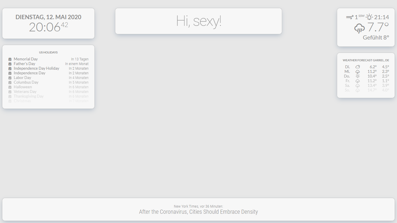
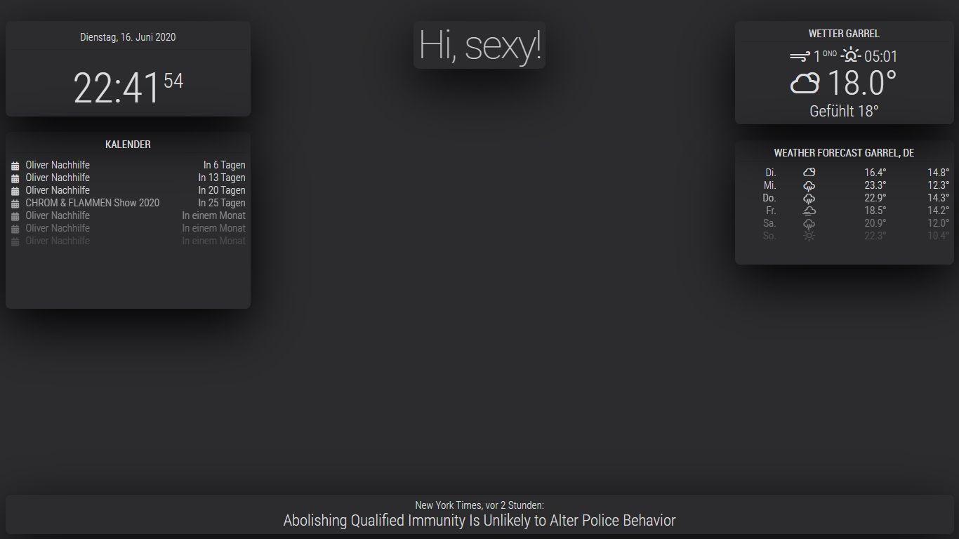
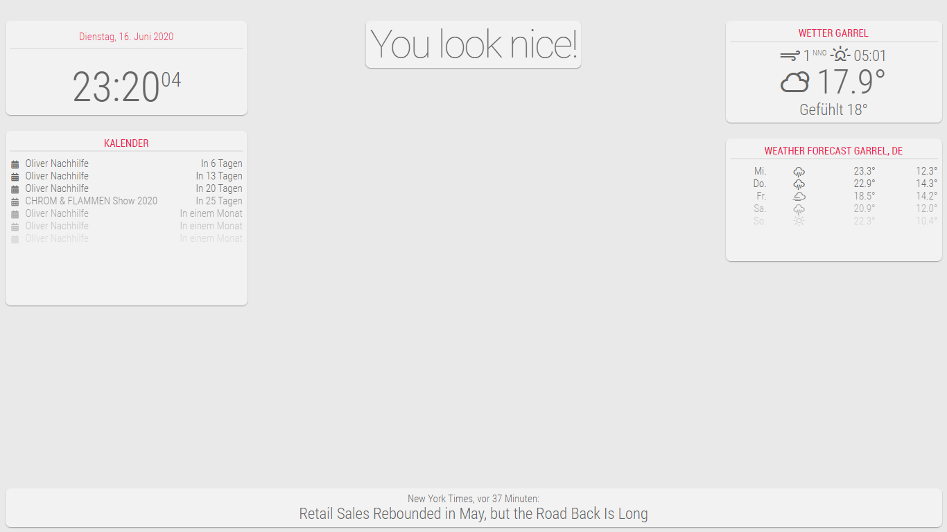
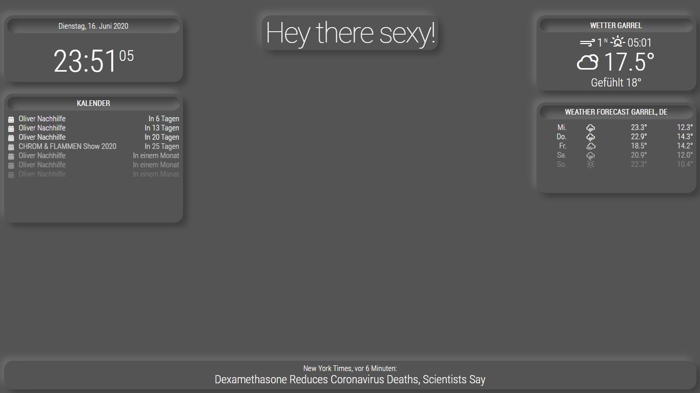
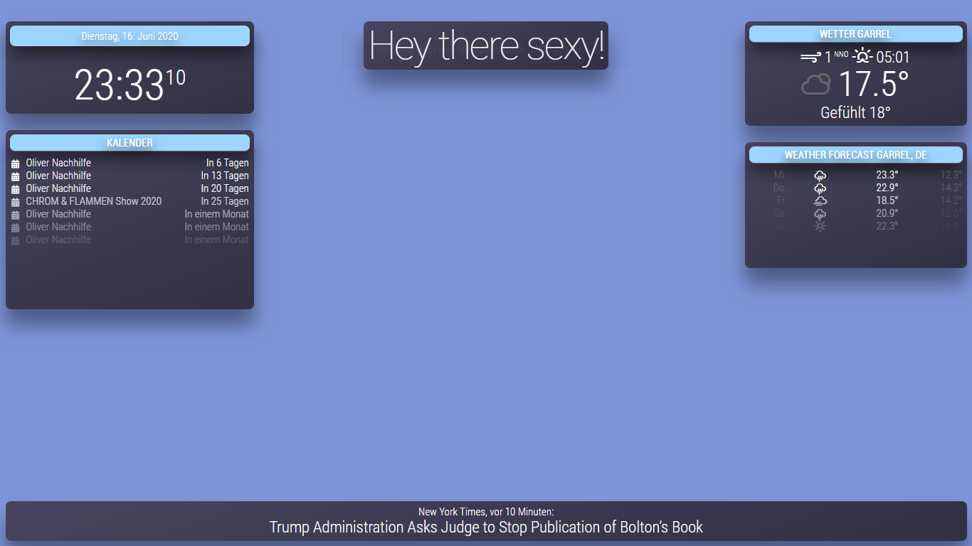
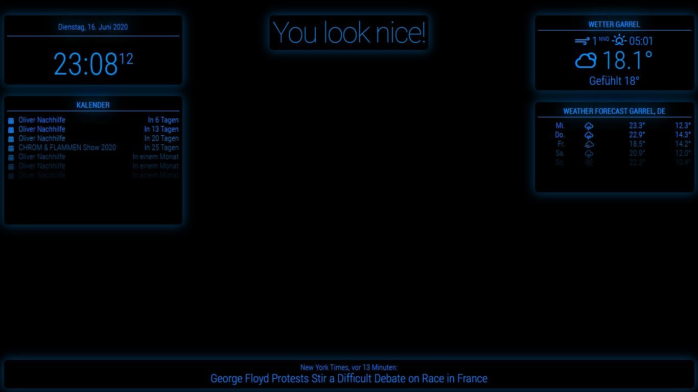
Here are some templates for all newbies.
1.Black boxes
CSS
html {
  cursor: default;
  overflow: hidden;
  background: #2c2c2d;
}


body {
  margin: 10px;
  position: absolute;
  width: calc(100% - 20px);
  height: calc(100% - 20px);
  margin-bottom: -10px;
  font-size: 1rem;
  font-weight: 300;
  line-height: 1.5;
  color: #dbdcdf;
  background: transparent;
}

header {
  background: transparent;
  padding: 0.5rem;
  text-align: center;
  border-bottom: 0.7px solid rgba(0, 0, 0, 0.1);
  color: #dbdcdf;
  font-size: 20px;
}
.dimmed {
  color: #dbdcdf;
}

.normal {
  color: #dbdcdf;
}

.bright {
  color: #dbdcdf;
}

/**
 * module.color_border_shadow
 */
 .module.clock,
 .module.calendar,
 .module.newsfeed,
 .module.weatherforecast,
 .module.currentweather,
 .module.compliments {
  padding:8px;
  border-radius: 10px;
  box-shadow: 0 2em 6em #000;
  background: transparent;
}

.clock .time {
 font-size: 80px;
 text-align: center;
 margin-top: 25px;
 color: #dbdcdf;
 padding: 15px;
}
.clock .date {
  background: transparent;
  padding: 5px;
  text-align: center;
  border-bottom: 0.7px solid rgba(0, 0, 0, 0.1);
  color: #dbdcdf;
  font-size: 20px;
}


/**
 * module.width_height
 */
.module.calendar {
  width:450px;
  height: 320px;
}
.module.weatherforecast {
  width:400px;
  height: 220px;
}
.module.currentweather {
  height: 180px;
  width:400px;
  text-align: center;
}
2.Material Design
CSS
html {
  cursor: default;
  overflow: hidden;
  background: #e9e9e9;
}


body {
  margin: 10px;
  position: absolute;
  width: calc(100% - 20px);
  height: calc(100% - 20px);
  margin-bottom: -10px;
  font-size: 1rem;
  font-weight: 300;
  line-height: 1.5;
  color: #666666;
  background: transparent;
}

header {
  background: transparent;
  padding: 0.5rem;
  text-align: center;
  font-size: 20px;
  color: #ed2553;
  border-bottom: 2px solid #e3e3e3;
}
.dimmed {
  color: #666666;
}

.normal {
  color: #666666;
}

.bright {
  color: #666666;
}

/**
 * module.color_border_shadow
 */
 .module.clock,
 .module.calendar,
 .module.newsfeed,
 .module.weatherforecast,
 .module.currentweather,
 .module.compliments {
  padding:8px;
  border-radius: 10px;
  box-shadow: 0 1px 3px rgba(0, 0, 0, 0.12), 0 1px 2px rgba(0, 0, 0, 0.24);
  background: #f2f2f2;
}

.clock .time {
 font-size: 80px;
 text-align: center;
 margin-top: 25px;
 color: #666666;
 padding: 15px;
}
.clock .date {
  background: transparent;
  padding: 5px;
  text-align: center;
  font-size: 20px;
  color: #ed2553;
  border-bottom: 2px solid #e3e3e3;
}


/**
 * module.width_height
 */
.module.calendar {
  width:450px;
  height: 320px;
}
.module.weatherforecast {
  width:400px;
  height: 220px;
}
.module.currentweather {
  height: 180px;
  width:400px;
  text-align: center;
}
3.Neumorphism
CSS
html {
  cursor: default;
  overflow: hidden;
  background: #545454;
}


body {
  margin: 10px;
  position: absolute;
  width: calc(100% - 20px);
  height: calc(100% - 20px);
  margin-bottom: -10px;
  font-size: 1rem;
  font-weight: 300;
  line-height: 1.5;
  color: #FFFFFF;
  background: transparent;
}

header {
  background: transparent;
  padding: 10px;
  text-align: center;
  font-size: 20px;
  color: #FFFFFF;
  border-radius: 23px;
  box-shadow: inset 11px 11px 16px #3e3e3e,
            inset -11px -11px 16px #6a6a6a;
}
.dimmed {
  color: #FFFFFF;
}

.normal {
  color: #FFFFFF;
}

.bright {
  color: #FFFFFF;
}

/**
 * module.color_border_shadow
 */
 .module.clock,
 .module.calendar,
 .module.newsfeed,
 .module.weatherforecast,
 .module.currentweather,
 .module.compliments {
  padding:8px;
  border-radius: 23px;
  background: #545454;
  box-shadow:  11px 11px 16px #3e3e3e,
             -11px -11px 16px #6a6a6a;
}

.clock .time {
 font-size: 80px;
 text-align: center;
 margin-top: 25px;
 color: #FFFFFF;
 padding: 15px;
}
.clock .date {
  background: transparent;
  padding: 2px;
  text-align: center;
  font-size: 20px;
  color: #FFFFFF;
  border-radius: 23px;
  box-shadow: inset 11px 11px 16px #3e3e3e,
            inset -11px -11px 16px #6a6a6a;
}


/**
 * module.width_height
 */
.module.calendar {
  width:450px;
  height: 320px;
}
.module.weatherforecast {
  width:400px;
  height: 220px;
}
.module.currentweather {
  height: 180px;
  width:400px;
  text-align: center;
}
4.Trending
CSS
html {
  cursor: default;
  overflow: hidden;
  background: #7e94d8;
}


body {
  margin: 10px;
  position: absolute;
  width: calc(100% - 20px);
  height: calc(100% - 20px);
  margin-bottom: -10px;
  font-size: 1rem;
  font-weight: 300;
  line-height: 1.5;
  color: #666666;
  background: transparent;
}

header {
  background: #9DD5FF;
  padding: 8px;
  text-align: center;
  font-size: 20px;
  color: #FFFFFF;
  text-shadow: 0px 10px 20px #000000;
  box-shadow: 0px 16px 30px 0px rgba(0, 0, 0, 0.53);
  border-radius: 10px;
}
.dimmed {
  color: #FFFFFF;
}

.normal {
  color: #FFFFFF;
}

.bright {
  color: #FFFFFF;
}

/**
 * module.color_border_shadow
 */
 .module.clock,
 .module.calendar,
 .module.newsfeed,
 .module.weatherforecast,
 .module.currentweather,
 .module.compliments {
  padding:8px;
  border-radius: 10px;
  box-shadow: 0px 31px 35px 0px rgba(0, 0, 0, 0.38);
  background: linear-gradient(159deg, #47455d 0%, #323045 97%);
}

.clock .time {
 font-size: 80px;
 text-align: center;
 margin-top: 25px;
 color: #FFFFFF;
 padding: 15px;
}
.clock .date {
  background: #9DD5FF;
  padding: 2px;
  text-align: center;
  font-size: 20px;
  color: #FFFFFF;
  text-shadow: 0px 10px 20px #000000;
  box-shadow: 0px 16px 30px 0px rgba(0, 0, 0, 0.53);
  border-radius: 10px;
}


/**
 * module.width_height
 */
.module.calendar {
  width:450px;
  height: 320px;
}
.module.weatherforecast {
  width:400px;
  height: 220px;
}
.module.currentweather {
  height: 180px;
  width:400px;
  text-align: center;
}
5.Tron
CSS
html {
  cursor: default;
  overflow: hidden;
  background: #000;
}


body {
  margin: 10px;
  position: absolute;
  width: calc(100% - 20px);
  height: calc(100% - 20px);
  margin-bottom: -10px;
  font-size: 1rem;
  font-weight: 300;
  line-height: 1.5;
  color: rgba( 0, 150, 254, 1 );
  background: transparent;
}

header {
  background: transparent;
  padding: 0.5rem;
  text-align: center;
  font-size: 20px;
  color: rgba( 0, 150, 254, 1 );
  text-shadow: 0 0 30px rgba( 0, 150, 254, .7 ), 0 0 50px rgba( 0, 150, 254, 1 );
  border-bottom: 0.7px solid rgba( 0, 150, 254, 1 );
}
.dimmed {
  color: rgba( 0, 150, 254, 1 );
}

.normal {
  color: rgba( 0, 150, 254, 1 );
}

.bright {
  color: rgba( 0, 150, 254, 1 );
}

/**
 * module.color_border_shadow
 */
 .module.clock,
 .module.calendar,
 .module.newsfeed,
 .module.weatherforecast,
 .module.currentweather,
 .module.compliments {
  padding:8px;
  border-radius: 10px;
  border-color: rgba( 0, 150, 254, 1 );
  box-shadow: 0 0 25px 2.5px rgba( 0, 150, 254, .4 );
  background: #000;
}

.clock .time {
 font-size: 80px;
 text-align: center;
 margin-top: 25px;
 color: rgba( 0, 150, 254, 1 );
 padding: 15px;
}
.clock .date {
  background: transparent;
  padding: 5px;
  text-align: center;
  border-bottom: 0.7px solid rgba( 0, 150, 254, 1 );
  color: rgba( 0, 150, 254, 1 );
  text-shadow: 0 0 30px rgba( 0, 150, 254, .7 ), 0 0 50px rgba( 0, 150, 254, 1 );
  font-size: 20px;
}


/**
 * module.width_height
 */
.module.calendar {
  width:450px;
  height: 320px;
}
.module.weatherforecast {
  width:400px;
  height: 220px;
}
.module.currentweather {
  height: 180px;
  width:400px;
  text-align: center;
}
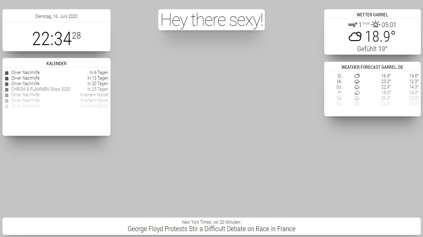
6.White Boxes
CSS
html {
  cursor: default;
  overflow: hidden;
  background: #c4c4c4;
}


body {
  margin: 10px;
  position: absolute;
  width: calc(100% - 20px);
  height: calc(100% - 20px);
  margin-bottom: -10px;
  font-size: 1rem;
  font-weight: 300;
  line-height: 1.5;
  color: black;
  background: transparent;
}

header {
  background: transparent;
  padding: 0.5rem;
  text-align: center;
  border-bottom: 0.7px solid rgba(0, 0, 0, 0.1);
  color: black;
  font-size: 20px;
}
.dimmed {
  color: black;
}

.normal {
  color: black;
}

.bright {
  color: black;
}

/**
 * module.color_border_shadow
 */
 .module.clock,
 .module.calendar,
 .module.newsfeed,
 .module.weatherforecast,
 .module.currentweather,
 .module.compliments {
  padding:8px;
  border-radius: 10px;
  box-shadow: 0 15px 20px -15px rgba(0, 0, 0, 0.3), 0 55px 50px -35px rgba(0, 0, 0, 0.3), 0 85px 60px -25px rgba(0, 0, 0, 0.1);
  background: white;
}

.clock .time {
 font-size: 80px;
 text-align: center;
 margin-top: 25px;
 color: black;
 padding: 15px;
}
.clock .date {
  background: transparent;
  padding: 5px;
  text-align: center;
  border-bottom: 0.7px solid rgba(0, 0, 0, 0.1);
  color: black;
  font-size: 20px;
}


/**
 * module.width_height
 */
.module.calendar {
  width:450px;
  height: 320px;
}
.module.weatherforecast {
  width:400px;
  height: 220px;
}
.module.currentweather {
  height: 180px;
  width:400px;
  text-align: center;
}