Read the statement by Michael Teeuw here.
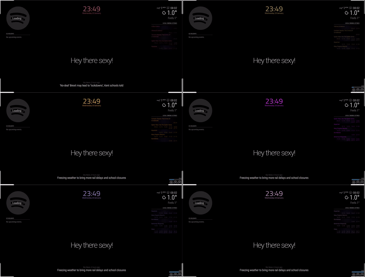
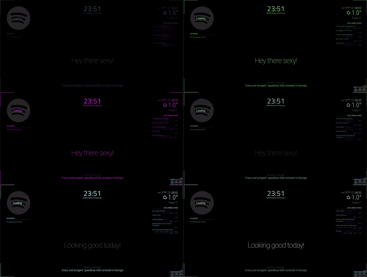
[MMM-Rainbow] Animated text color transition
-
MMM-Rainbow - Animated text color transition.
Update info: As suggested, I have added the option to assign the random colors to specific modules or to all modules. See the config below to see how to use.
Preview
Modular

Non-Modular

Installation
Installation is very simple, just clone the git into your modules directory then add the module to your config.
cd ~/MagicMirror/modules
git clone https://github.com/aSeann/MMM-Rainbow
Using the module
To use this module, add the following configuration block to the modules array in the
config/config.jsfile:var config = { modules: [ { module: "MMM-Rainbow", /* Position not required as it has no UI. */ config: { fadeTime: 1500, // Duration in milliseconds it takes for the color to fade. nextColor: 1500, // Duration in milliseconds until the next random color is generated and set. modular: false, // moduleList: [ // Only required if modular is true. "MMM-iClock", "MMM-Showtimes" ] } }, ] } -
Kinda cool. :-)
-
@mykle1 Thanks, I didn’t actually expect any response to this. I have started experimenting with other things though, so expect to see a few more posts from me. :grinning_face:
-
The more, the merrier. When I started this I never expected anyone to even look at my work. You never know what others might find interesting. My motto: Have fun!
-
I really like the idea of this module, I’m searching for the possibility to make only my clock have this effect and maybe a gradient kind of color shift. Can you help me with this idea?
-
@ganget Sure man, seems simple enough. You could always customize the clock module, or recreate your own and just add a class name to the clock, then alter MMM-Rainbow.js to only change the css for that module. I cheated when creating this module by using jQuery so it’s really simple to mess with. But if you do need any help, feel free to give me a message.
-
Love the concept, actually. Would love to see it limited to the user’s choice of modules, however.
-
MMM-NOAA3 has been doing this for some time now, as an option
-
@mykle1 doing what? I was referring to the original rainbow color. Would be cool to apply it to modules of choice.
-
@bkeyport said in [MMM-Rainbow] Animated text color transition:
doing what? I was referring to the original rainbow color.
Lets see. The topic states “[MMM-Rainbow] Animated text color transition” so I guess I was talking about that. Only noticed you because you mentioned me directly. I think @seann has done a fantastic job here. Joined the forum 8 days ago and already he’s contributing and offering his
help to others. He and I are going get along just fine. :-) -
So, you’re saying the NOAA weather app does rainbow colors for other modules?
… Okay.
-
@bkeyport Also, this is easily done. I’ll work on this for you when I have some more free time. The only issue with doing it to the clock is; the current clock uses “updateDom” to set the time each second, which from what I have seen basically re creates the elements. Meaning the transitions start from when the element is created so it’s not in time with the other transitions. So it would be easier to create your own clock module which just replaces the innerHTML of each element instead of re creating them. I have been making my own clock which will display down to minutes instead of seconds as i’m sure this would cause less strain on my terrible Pi 3 a+.
-
Actually, I’d be more interested in the mechanics in getting it to work down to the module level more than anything, would be nice to use it for say “Grabbing Attention” in a particular module…
-
@seann I took a different approach to this, mainly because I only wanted to have it for only one module. I have changed my custom.css and one line in the clock.js, so it grabs a different style.
My code makes a gradient background which I clip to the text. Then to make it move across the text i use webkit-animation. I’m not totally satisfied with the result of the animation yet but i will keep tweaking that.the animation moves way too fast now and when I make the animation duration longer it doesn’t feature all the colors of the gradient.
the only line i needed to change in the clock.js filetimeWrapper.className = "time clock-time-only-color large light";Custom.css (lines i added)
.clock-time-only-color {
	background-image: linear-gradient(to right, #ff0000,#ff4000,#ff8000,#ffbf00,#ffff00,#bfff00,#80ff00,#40ff00,#00ff00,#00ff40,#00ff80,#00ffbf,#00ffff,#00bfff,#0080ff,#0040ff,#0000ff,#4000ff,#8000ff,#bf00ff,#ff00ff,#ff00bf,#ff0080,#ff0040,#ff0000);
	-webkit-background-clip:  text;
	-webkit-animation: animate 3s linear infinite;
	background-size: 500%;
	color: transparent;

}
@-webkit-keyframes animate{
	0%	{background-position: 0% 500%;}
	50%	{background-position: 100% 0%;}
	100%    {background-position: 0% 100%;}
	}
Do you have any idea on how I can make the animation duration way longer like 10 min and still show all the colors in the gradient?
Thank you for the initial idea and for inspiring me!
-
@ganget I’m not really that good with css animations but from what I can see,
-webkit-animation: animate 3s linear infinite;should have something to do with it right? maybe if you make that 10 minutes instead.
-
@seann yeah i tried increasing the number to like 20 sec up to 6000. But the problem i get then is that it shows me only the first 2 colors in the gradient. Dunno but will try and work on it tomorrow
-
change your background size to 20% instead of 500%
Only other issue I find is that it refreshes itself every second, would be better if it were more fluid-like that the refresh isn’t so notice-able.
-
So, I modified my MMM-DigClock with your rainbow css with some other tweaks…
.MMM-DigClock .time {
  font-size: 300px;
  text-align: center;
  line-height: 85%;
  letter-spacing: 5px;
  font-weight: 900;
  font-family: DS-Digital;
  background: -webkit-linear-gradient(left, red,orange,yellow,green,blue,purple);
  background: -moz-linear-gradient(left, red,orange,yellow,green,blue,purple);
  background: -o-linear-gradient(left, red,orange,yellow,green,blue,purple);
  background: linear-gradient(to left, red,orange,yellow,green,blue,purple);
  -webkit-background-clip: text;
  -moz-background-clip: text;
  background-clip: text;
  -webkit-animation: animate 10s linear infinite;
  -moz-animation: animate 10s linear infinite;
  -o-animation: animate 10s linear infinite;
  animation: animate 10s linear infinite;
  background-size: 25%;
  -webkit-text-fill-color: transparent;
}
And it seems to work fairly decent.
But I had to change the update interval within the clock code to update every minute instead of every second, by placing the following within thestart: function()…// Schedule update interval. var self = this; setInterval(function() { self.updateDom(); }, 60000); -
@seann
you can change the update interval within the clock code to update every minute instead of every second, by placing the following within thestart: function()…// Schedule update interval. var self = this; setInterval(function() { self.updateDom(); }, 60000); -
@justjim1220 Good tip man! I will change the update interval and look at the difference.
Hello! It looks like you're interested in this conversation, but you don't have an account yet.
Getting fed up of having to scroll through the same posts each visit? When you register for an account, you'll always come back to exactly where you were before, and choose to be notified of new replies (either via email, or push notification). You'll also be able to save bookmarks and upvote posts to show your appreciation to other community members.
With your input, this post could be even better 💗
Register Login