Read the statement by Michael Teeuw here.
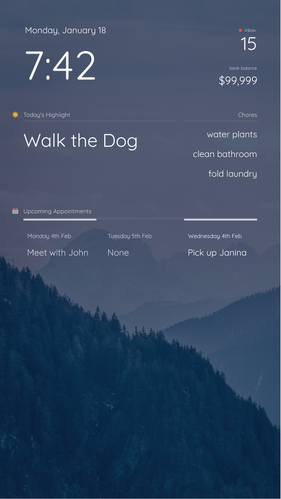
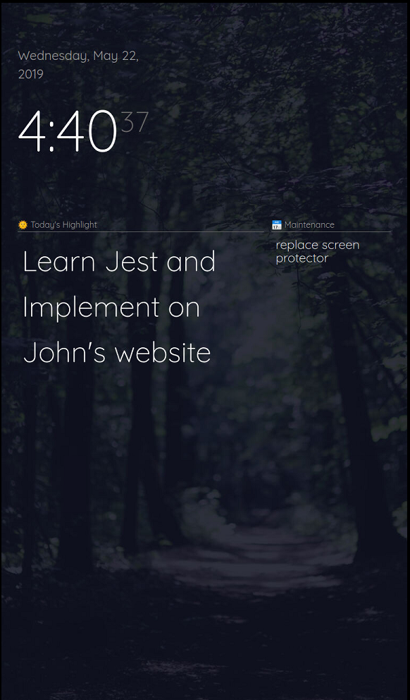
Magic Mirror Redesign WIP :D
-
@smackenzie5 nice good news, glad it was quick to get.
What sdetweil said, did ya put quotes around the key?
-
@lavolp3 Yup, no problem :D hope it works out, if you’re having layout troubles feel free to post a screenshot. Haven’t tested this on a more filled out layout so I’d be curious how it looks
-
-
@earlman
I have question
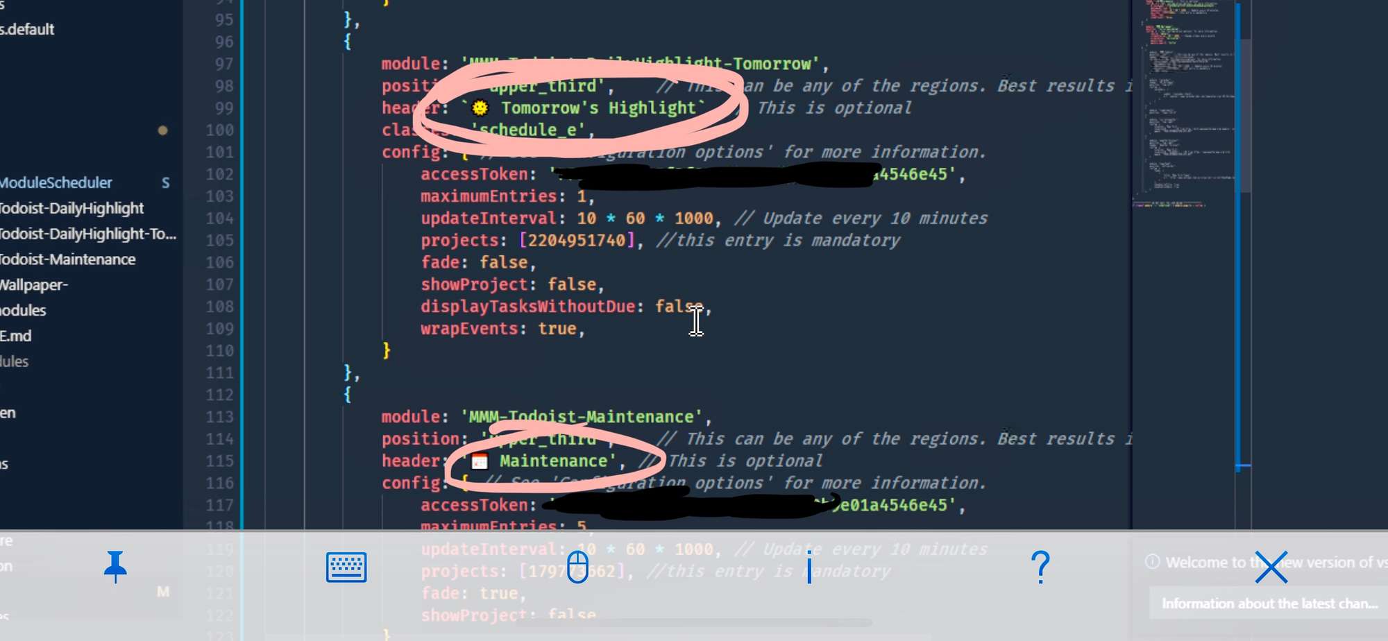
how to add emoji or Icon on Header Text
Thanks for hint -
@nobita You can put them straight into the “header” field on your config file. If you’re using Windows, press [WINDOWSKEY + .] Not sure how to insert emojis on a mac, though. Hope that helps.
-
@earlman I See, Thanks for quick hint answer
-
Hi, it’s really pretty! Can these templates be downloaded for my mirror? or is it a private job?
-
Hey…
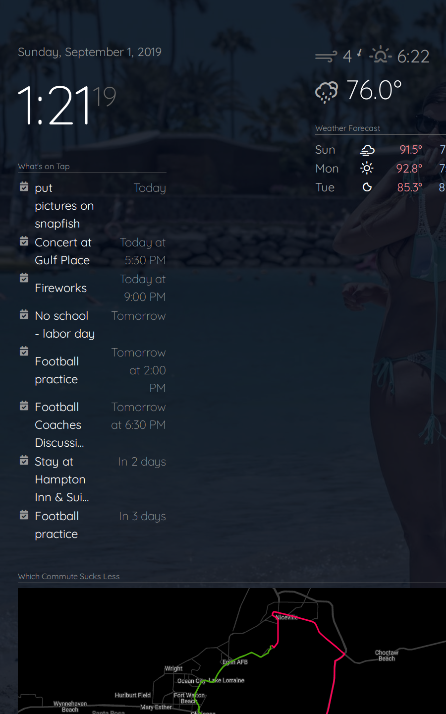
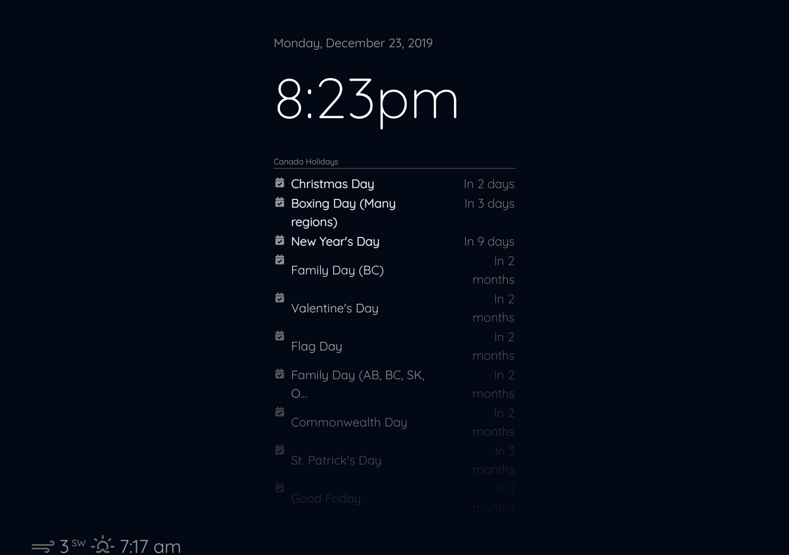
So I am trying to make this a dashboard instead of behind a mirror so I wanting to completely change the look. This looks like a great start. Thanks. I am on a 32" monitor and it doesn’t look correct. Is the code for portrait only?
This is with the default config, so clock and calendar should be top left.
-
I am having the exact same issue. Is this thread still open? @earlman
-
I have this same problem as well. I am no CSS expert and don’t have a solution yet but it appears that the “updatenotification” module is taking up that spot on the left. You can comment it out and test this. I think he said this would work with existing configurations but I don’t see how it will. It uses a grid layout, which again, I don’t know exactly how it is works, but this does not seem to allow the same layout. It also pushes stuff off the bottom, in your picture I would imagine the Weather module is “top_right” but it gets pushed down because of the grid layout and the length of the calendar. So if yours is like mine the clock & calendar are top_left and the weather is top_right. There’s probably other information (modules) in your layout it is not even showing, the “compliments” perhaps, which might be lower_third.
If you just want the look, you could just use the original main.css file and add the first line from his main.css file to load the Quicksand font, then change all the references in the file from “Roboto Condensed” to “Quicksand”. You can also add the “custom.css” information as he explained which will changes the clock and wallpaper, if you use that module. Still trying to see if there is a way to get this to work.
-
@dbinott said in Magic Mirror Redesign WIP :D:
This is with the default config, so clock and calendar should be top left.
@dbinott has obviously changed fonts, and perhaps css as well. Using the default config has nothing to do with positioning of modules other than what region to display the module in. Changes to css will override the default position and perhaps unwanted results will be the outcome. I’ve just done a fresh install of MM on a Pi and I’m not seeing this behavior.
I would try reverting all your changes back to the original. By all means, disable the “updatenotification” module and try again.
-
The only reason disabling the “updatenotification” module helps is because it is set to a location of “top_bar”, removing it allows everything to move over. I tracked this down to the CSS of course. He basically removed all region stuff and put in only two grid tags. The problem is that there is a div for “top_bar” (not to be confused with the location top_bar), then a container in that, with top_left, top_middle, and top_right within that. The container tag is for the top_bar. Since there is only one CSS tag for each of the top and bottom bars, nothing says to do anything special with the top_bar location so the top_bar is not separate from the top left middle and right. When a grid is used, everything just populates the grid, the top_bar is not separated from the top left, middle and right. This sort of confusing since the top_bar div contains “container”, “top_left”, “top_middle”, and “top_right”. I should say it confuses me, probably doesn’t confuse anyone who knows what they are doing. It’s just that if you style top_bar, it affects “top_bar”, “top_right”, “top_middle”, and “top_left”. It appears you need to style the container.
Again, just an observation looking at it in dev view, I don’t really know how it works. I was able to get it to work by using a “grid-area” for the container and setting it to span one row and 3 columns for the top and bottom containers. I don’t know if this really will break if other modules are added to other locations or more than one module is added to a particular location.
-
Hi, the region bottom bar has four elements. The bottom bar, the bottom left, the bottom center and the bottom right. Since they are in a grid with thirds, one always get pushed to the next row. Since I only use the bottom bar and not the left/center/right I changed the grid-template-columns: 100% 0% 0% 0%; So the bar is 100% and the rest each 0%.
-
HI GUYS,
Sorry I’ve been MIA. Recently moved to a new condo, so I’ve been busy with that. Finally have some time to take a look at this, so expect some updates in the near future.
Thank you all for the interest ☺
-
@dbinott @jcmd13 @RuKeBo @Mykle1
Add
.top.bar > .container {
    grid-column: 1 / -1;
}
to your
main.css.I think that’ll do the trick. I don’t have any modules with notifications installed atm, so if somebody could post a screenshot of how that looks (after adding the above CSS), it would be a big help
-
@aarish could you post some screenshots?
I’ve updated the main.css file here:
https://github.com/foundations-design/WhiteLight/blob/master/css/main.cssI think the part that’s relevant to your issue is from “Layout Stuff” down (line 144 in the main.css file)
-
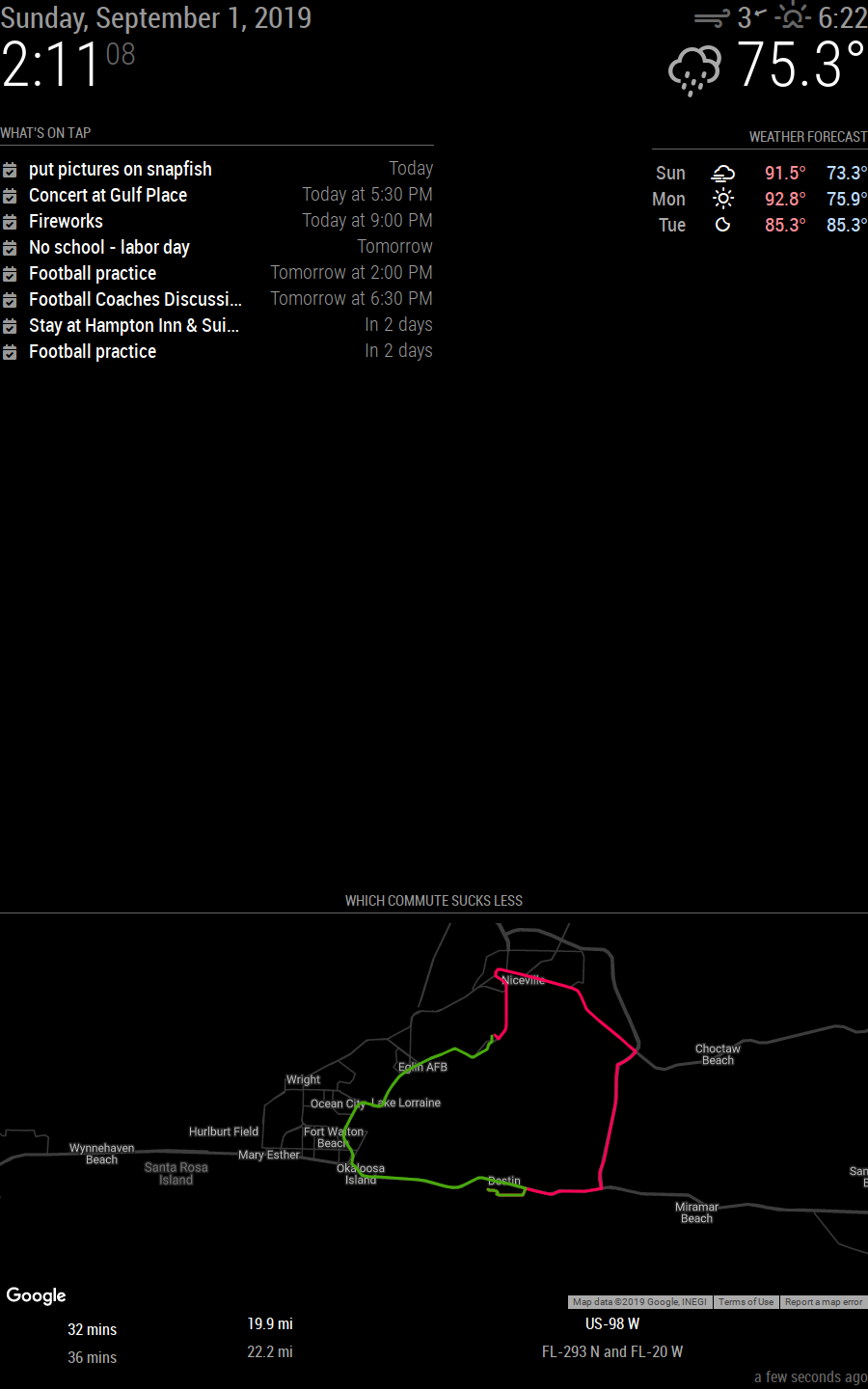
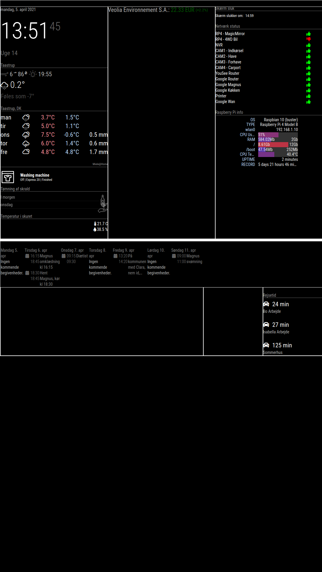
As you can see, the top_bar and bottom_bar dosent work.
The calender should be in the bottom_bar and the stock should be in the top_bar
-
thanks for the screenshot. try using this css for your
main.css:root { /**** COLOR ****/ --color-text: #fff; --color-background: black; /**** TYPOGRAPHY ****/ --font-primary: "Roboto Condensed"; --font-secondary: "Roboto"; --base: 20px; --text-scale: 1.5; --text-xs: calc(var(--base) / var(--text-scale)); --text-sm: var(--base); --text-md: calc(var(--text-sm) * var(--text-scale)); --text-lg: calc(var(--text-md) * var(--text-scale)); --text-xl: calc(var(--text-lg) * var(--text-scale)); --text-2xl: calc(var(--text-xl) * var(--text-scale)); --text-3xl: calc(var(--text-2xl) * var(--text-scale)); /**** SPACING ****/ --grid-gap: 1rem; --outside-margin: 4rem; } html { cursor: none; overflow: hidden; background: var(--color-background); user-select: none; font-size: var(--base); } ::-webkit-scrollbar { display: none; } body { background: var(--color-background); color: var(--color-text); font-family: var(--font-primary), sans-serif; font-weight: 400; line-height: 1.5; margin: 0; -webkit-font-smoothing: antialiased; } /** * Default styles. */ .dimmed { color: var(--color-text); opacity: 0.4; } .normal { color: var(--color-text); opacity: 0.7; } .bright { color: var(--color-text); opacity: 1; } .xsmall { font-size: var(--text-xs); line-height: 1.4; } .small { font-size: var(--text-sm); line-height: 1.4; } .medium { font-size: calc(var(--text-md)); line-height: 1.4; } .large { font-size: calc(var(--text-lg)); line-height: 1; } .xlarge { font-size: calc(var(--text-xl)); line-height: 1; letter-spacing: -3px; } .thin { font-family: var(--font-secondary), sans-serif; font-weight: 100; } .light { font-family: var(--font-primary), sans-serif; font-weight: 300; } .regular { font-family: var(--font-primary), sans-serif; font-weight: 400; } .bold { font-family: var(--font-primary), sans-serif; font-weight: 700; } .align-right { text-align: right; } .align-left { text-align: left; } header { text-transform: uppercase; font-size: 1rem; font-family: var(--font-primary), Arial, Helvetica, sans-serif; font-weight: 400; border-bottom: 1px solid #666; line-height: 15px; padding-bottom: 5px; margin-bottom: 10px; color: #999; } sup { font-size: 50%; line-height: 50%; } /** * Module styles. */ .module { margin-bottom: 30px; } .region.bottom .module { margin-top: 30px; margin-bottom: 0; } .no-wrap { white-space: nowrap; overflow: hidden; text-overflow: ellipsis; } .pre-line { white-space: pre-line; } /** * * LAYOUT STUFF * */ .region { width: 100%; } .region.fullscreen { position: absolute; height: 100vh; width: 100vw; top: 0; left: 0; right: 0; bottom: 0; z-index: -1; pointer-events: none; } .region.fullscreen * { pointer-events: auto; } .region table { width: 100%; border-spacing: 0; border-collapse: separate; } body { display: grid; grid-gap: var(--grid-gap); grid-template-rows: repeat(5, minmax(0, max-content)); padding: var(--outside-margin); place-items: stretch; height: 100vh; } .top.bar { display: grid; grid-gap: var(--grid-gap); grid-template-columns: repeat(3, 1fr); } .top.bar > .container { grid-column: 1 / -1; } .bottom.bar { display: grid; grid-gap: var(--grid-gap); grid-template-columns: repeat(3, 1fr); } .bottom.bar > .container { grid-column: 1 / -1; } .left { grid-column: 1 / 2; } .right { grid-column: -1 / -2; } .region { /* for testing */ /* border: 1px solid white; */ } -
@earlman
Tryed the new main.css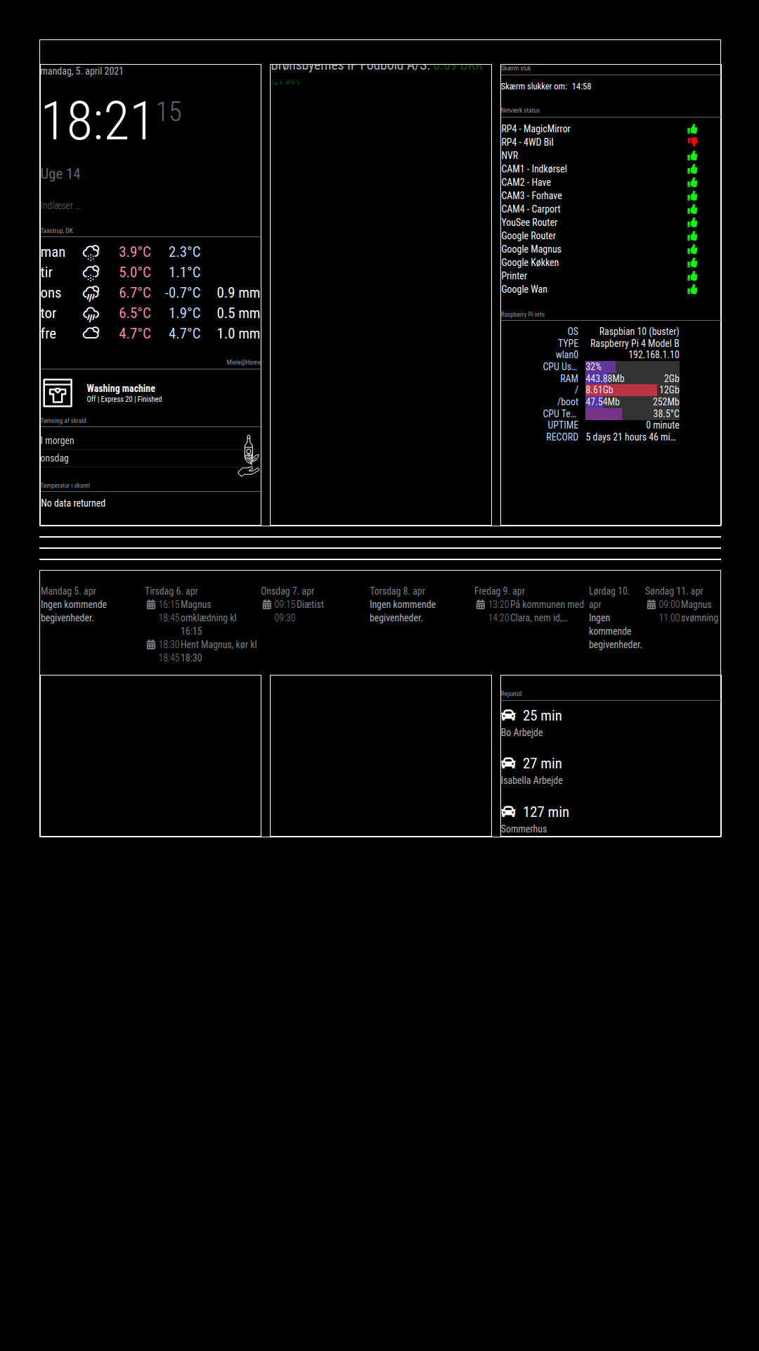
Stock i working, it should be “top_bar”.
Calender should be position: “bottom_bar”, under travle time, but bottom_bar is over bottom_left, bottom_center and bottom_right -
@bravooscar
try this::root { /**** COLOR ****/ --color-text: #fff; --color-background: black; /**** TYPOGRAPHY ****/ --font-primary: "Roboto Condensed"; --font-secondary: "Roboto"; --base: 20px; --text-scale: 1.5; --text-xs: calc(var(--base) / var(--text-scale)); --text-sm: var(--base); --text-md: calc(var(--text-sm) * var(--text-scale)); --text-lg: calc(var(--text-md) * var(--text-scale)); --text-xl: calc(var(--text-lg) * var(--text-scale)); --text-2xl: calc(var(--text-xl) * var(--text-scale)); --text-3xl: calc(var(--text-2xl) * var(--text-scale)); /**** SPACING ****/ --grid-gap: 1rem; --outside-margin: 4rem; } html { cursor: none; overflow: hidden; background: var(--color-background); user-select: none; font-size: var(--base); } ::-webkit-scrollbar { display: none; } body { background: var(--color-background); color: var(--color-text); font-family: var(--font-primary), sans-serif; font-weight: 400; line-height: 1.5; margin: 0; -webkit-font-smoothing: antialiased; } /** * Default styles. */ .dimmed { color: var(--color-text); opacity: 0.4; } .normal { color: var(--color-text); opacity: 0.7; } .bright { color: var(--color-text); opacity: 1; } .xsmall { font-size: var(--text-xs); line-height: 1.4; } .small { font-size: var(--text-sm); line-height: 1.4; } .medium { font-size: calc(var(--text-md)); line-height: 1.4; } .large { font-size: calc(var(--text-lg)); line-height: 1; } .xlarge { font-size: calc(var(--text-xl)); line-height: 1; letter-spacing: -3px; } .thin { font-family: var(--font-secondary), sans-serif; font-weight: 100; } .light { font-family: var(--font-primary), sans-serif; font-weight: 300; } .regular { font-family: var(--font-primary), sans-serif; font-weight: 400; } .bold { font-family: var(--font-primary), sans-serif; font-weight: 700; } .align-right { text-align: right; } .align-left { text-align: left; } header { text-transform: uppercase; font-size: 1rem; font-family: var(--font-primary), Arial, Helvetica, sans-serif; font-weight: 400; border-bottom: 1px solid #666; line-height: 15px; padding-bottom: 5px; margin-bottom: 10px; color: #999; } sup { font-size: 50%; line-height: 50%; } /** * Module styles. */ .module { margin-bottom: 30px; } .region.bottom .module { margin-top: 30px; margin-bottom: 0; } .no-wrap { white-space: nowrap; overflow: hidden; text-overflow: ellipsis; } .pre-line { white-space: pre-line; } /** * * LAYOUT STUFF * */ .region { width: 100%; } .region.fullscreen { position: absolute; height: 100vh; width: 100vw; top: 0; left: 0; right: 0; bottom: 0; z-index: -1; pointer-events: none; } .region.fullscreen * { pointer-events: auto; } .region table { width: 100%; border-spacing: 0; border-collapse: separate; } body { display: grid; grid-gap: var(--grid-gap); grid-template-rows: repeat(5, minmax(0, max-content)); padding: var(--outside-margin); place-items: stretch; height: 100vh; } .top.bar { display: grid; grid-gap: var(--grid-gap); grid-template-columns: repeat(3, 1fr); } .top.bar > .container { grid-column: 1 / -1; } .bottom.bar { display: grid; grid-gap: var(--grid-gap); grid-template-columns: repeat(3, 1fr); } .bottom.bar > .container { grid-column: 1 / -1; grid-row: 2; } .bottom.bar > .bottom { grid-row: 1; } .left { grid-column: 1 / 2; } .right { grid-column: -1 / -2; } /* for testing */ .region { /* border: 1px solid white; */ }
Hello! It looks like you're interested in this conversation, but you don't have an account yet.
Getting fed up of having to scroll through the same posts each visit? When you register for an account, you'll always come back to exactly where you were before, and choose to be notified of new replies (either via email, or push notification). You'll also be able to save bookmarks and upvote posts to show your appreciation to other community members.
With your input, this post could be even better 💗
Register Login