Read the statement by Michael Teeuw here.
MMM-NOAA - Another Weather Module
-
Hello,
First of all, thanks for your work.
I did have the same issue that @gashion had. I read your comment, it fix it !
But… to be honnest I really prefer the v1 look and feel. So is there a way to revert change and stay back in the v1 version ? -
@tbbear
How stupid of me. I replaced it and it works now. Thank you! :) -
I had the same issue. The change to config.js did fix it but now the temp is showing in Celsius. My locals are:
        language: "en",
        timeFormat: 24,
        units: "imperial",
any idea?
Thanks!
-
@stevegoble hi, this units option does only work for the default weather module. In NOAA its the value of the time format so 24 hours is european so Celsius, 12 hours is USA so Fahrenheit. Where are u living?
-
@tbbear
Thank you for the quick response. I am in Atlanta, GA USA. I prefer 24 hour clock so…sigh. -
@stevegoble if u have a few minutes i can fix it for u cause i just saw that v1 used units
-
@stevegoble ok, done do a git pull and u have it like it was using units
-
BAH! I just made the locale change to 12!! Thanks a bunch for the fix, I’ll update now… you da man!!
-
@stevegoble we love to make the users happy (if we can or we made the mistake lol)
-
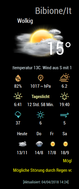
I saw that lot’s of people dont like the headers in v2 so maybe an idea for a headerless option. Please let us know if u would like this option:
( Bild Link)
 -
It looks much better :)
-
If you prefer not to have colored headers put this into your custom css file:
.MMM-NOAA .rheading {
background-color: transparent;
color: white;
}While module makers like to entertain ideas adding more config options is not always the
best answer when it can be changed easily using custom.css.There in lies the problem some like it, some don’t. Some like V1 of NOAA better.
So there will be 2 versions…1 and 2. :)
V1 can be found here -> http://173.56.209.189:443/topic/26/mmm-noaa-v1
[This is the only place you can get it from] :)V2 still on github [There will be no config option for this, instead use custom.css]
-
@tbbear said in MMM-NOAA - Another Weather Module:
I saw that lot’s of people dont like the headers in v2
Where? :-)
-
I changed the colors of the header to black. Looks better now…For me…
-
Good job and great module!
I managed with the custom.css, but I think the temperature can be seen very bad. Is it possible to reduce the size of the symbol or change the color of the font?

-
@Mykle1 there is a topic about the 3 top modules and their i found it
-
@tbbear said in MMM-NOAA - Another Weather Module:
> I saw that lot’s of people dont like the headers in v2
>@Mykle1 there is a topic about the 3 top modules and their i found it
This topic only mentions MMM-NOAA twice, and only one of those mentions headers.
Soooooo, lot’s = 1? :-)
-
@Mykle1 another (by the way both developer) also said that they only like V1 and i got a few chats from german users they said the same so IT’S A LOT. I only want to help leading NOAA to the top.
U are my friend, so please dont let me stand as an id…, thanks -
I wouldn’t know about the others you mentioned. I’m only going by what you said. My mistake. Yes, you are my friend. Friendly enough to question your statements. :-)
I think MMM-NOAA is the top weather module. From the very beginning, @cowboysdude’s vision, design and implementation has been new and exciting. I’ve congratulated him a thousand times although it makes me sick with jealousy (NOT).
Peace!
-
@Mykle1 Thanks so peace, Mykle u are also a very special developer 15 year ago when i was still in work i would have payed u a lot to be in my team, so no need to be jealouse same for John, but never forget maybe this is my problem i was 30 years a professional Software Manager for very expensive software so for me the user and his will was the law.
Take care my friend
Hello! It looks like you're interested in this conversation, but you don't have an account yet.
Getting fed up of having to scroll through the same posts each visit? When you register for an account, you'll always come back to exactly where you were before, and choose to be notified of new replies (either via email, or push notification). You'll also be able to save bookmarks and upvote posts to show your appreciation to other community members.
With your input, this post could be even better 💗
Register Login


