Read the statement by Michael Teeuw here.
Magic Mirror Redesign WIP :D
-
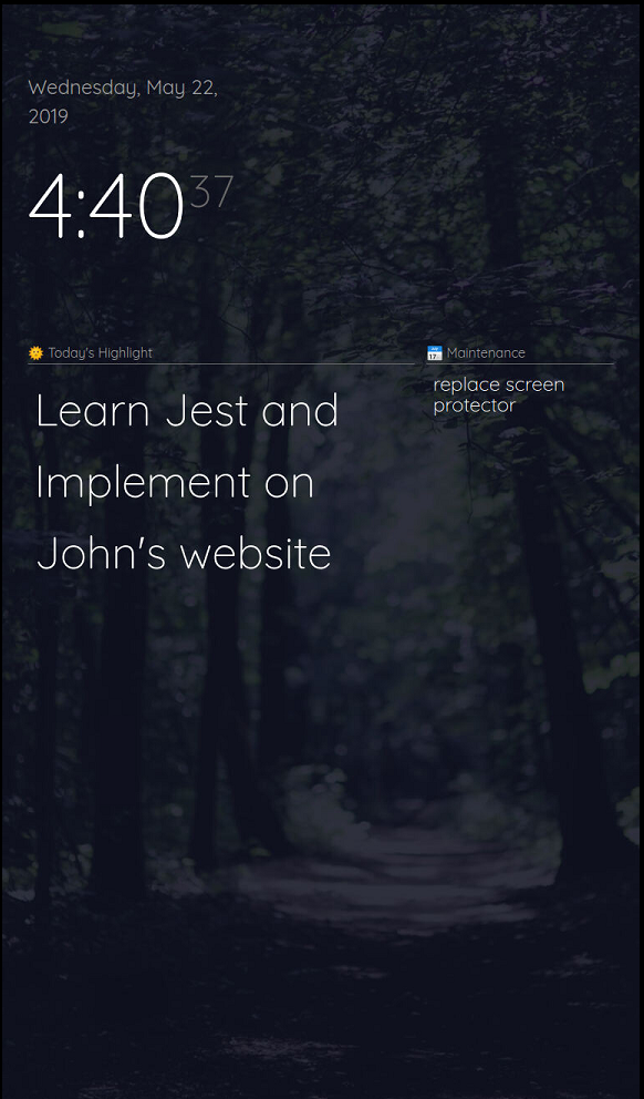
This is how it currently looks
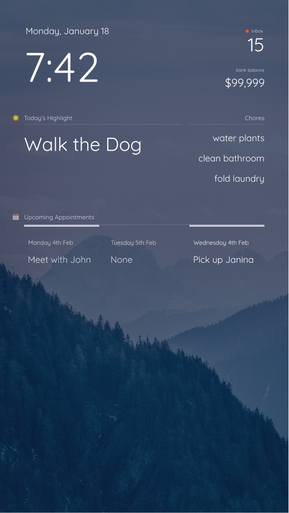
This is what I’m planning for the eventual v1.0.0 release:
If you’re interested in how I did this, let me know. I dove pretty deep into the development. Here’s some not-so-apparent features I’ve added:
- Refactored the Layout in main.css to use CSS Grid
- This allows for a more flexible layout that’s easier to work with
- Modified MMM-Wallpaper to load images from Pexels
- Using two instances of MMM-Todoist to load my “Daily Highlight” for the day
- After 6:00pm, changes the Daily Highlight to tomorrow’s highlight
- Refactored the Layout in main.css to use CSS Grid
-
@earlman HI! That looks fantastic, very nice work! Which calendar modul are you planning to use? I would love something like this - in weekly view. I would be greatful if you could point me in the right direction with this. Thanks for sharing!
-
-
@earlman Hiyaa! Thanks for your reply. I will try the linked module - I am quite new to js and css, would you mind to share some of your calendar related CSS? I am especially curious of the upper border styiling in the second image you posted. Thanks in advance, have a great day!
-
@skibro That’s actually just a mockup I made in Figma (a design tool). I haven’t built that into my mirror yet, by since you’re interested, I’ll move that up the priority list. I’ll post back here when I have something up on github.
-
@earlman this looks proper nice do you mind sharing the whole lot i.e. your css, the wallpapers etc?
Thanks.
-
@bachoo786 @skibro What modules are you guys currently using? I’m doing some prep work for release and wanna make sure it works with your current setups
-
Is it possible to use horizontal layout instead vertical?
-
@Sean yup! The reason I messed around with the CSS so much was to make it much more flexible with different screen sizes. I’ll post a screenshot once I get back to my computer
-
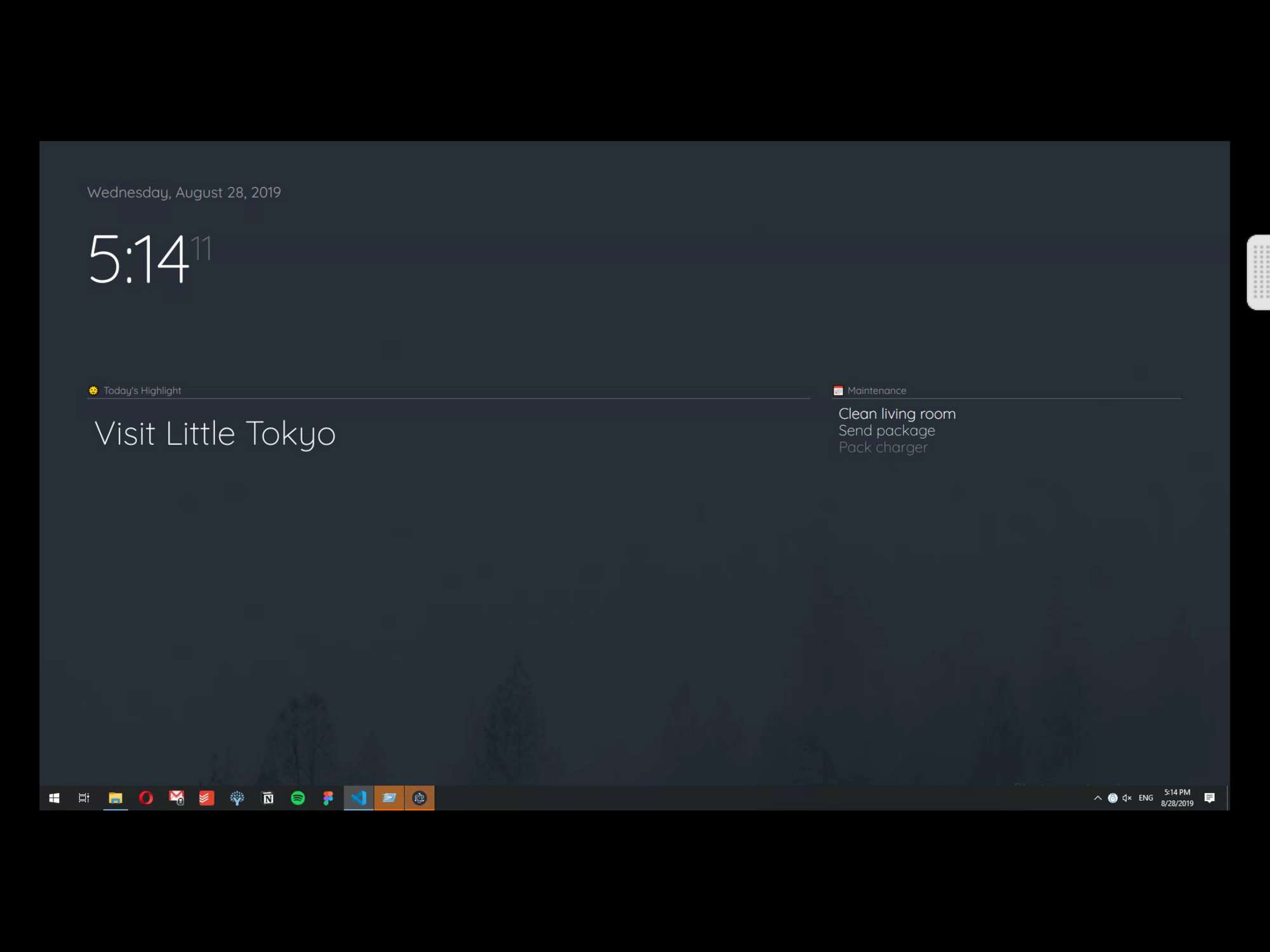
@Sean i like keeping it pretty minimal right now, but here’s what it looks like in landscape
-
@earlman
I’m using the default clock, calendar, current weather, and weather forecast. I’m also using google-route. I’d be interested in anything you could do to make the Google map look better in the route module. I assume you don’t care about the modules that run in the background and don’t show on the screen. Thanks -
@earlman
Looks so nice. I want to try yours. -
Project Update (& Installation Instructions)
@skibro @bachoo786 @Sean @smackenzie5
Alrighty y’all! Got some great news for those who wanna try this setup out. Heads up though—might take a bit of time to set up,
so don’t expect to get it looking right in a couple clicks.First, I’ve added Pexels support to MMM-Wallpaper (thanks @kolbyjack for the quick response).
As for everything else, all the instructions for setting it up can be found here
Though I’ve been doing development work for a while, this is one of my first open-source projects, so I’ll definitely do my best to help you guys out if you need it.
-
@earlman I have to say I really love the grid concept. I have a monitor sitting in the lower right corner of the mirror and a grid design would look much better.
Can you share your main.css or is it on GitHub?
Sorry just saw the latest reply with all the information I needed. Thanks man!! -
@earlman
Thanks for putting this together.
Finally had some time to work on this today but got the following error message when running it for the first time:pi@raspberrypi:~ $ cd MagicMirror pi@raspberrypi:~/MagicMirror $ sudo npm start > magicmirror@2.7.1 start /home/pi/MagicMirror > sh run-start.sh Starting MagicMirror: v2.7.1 Loading config ... WARNING! Could not validate config file. Starting with default configuration. Please correct syntax errors at or above this line: /home/pi/MagicMirror/config/config.js:116 pexels_key: [my API key was here], ^^^^^^ SyntaxError: Invalid or unexpected token at new Script (vm.js:74:7) at createScript (vm.js:246:10) at Object.runInThisContext (vm.js:298:10) at Module._compile (internal/modules/cjs/loader.js:678:28) at Object.Module._extensions..js (internal/modules/cjs/loader.js:722:10) at Module.load (internal/modules/cjs/loader.js:620:32) at tryModuleLoad (internal/modules/cjs/loader.js:559:12) at Function.Module._load (internal/modules/cjs/loader.js:551:3) at Module.require (internal/modules/cjs/loader.js:658:17) at require (internal/modules/cjs/helpers.js:20:18) Loading module helpers ... Initializing new module helper ... Module helper loaded: updatenotification No helper found for module: helloworld. All module helpers loaded. Starting server on port 8080 ... Server started ... Connecting socket for: updatenotification Sockets connected & modules started ... Launching application.Here’s my config.js:
{
			module: "MMM-Wallpaper",
			position: "fullscreen_below",
			config: { // See "Configuration options" for more information.
				source: "pexels",
    				slideInterval: 60 * 1000, // Change slides every minute
    				orientation: "vertical",
    				pexels_key: [my API key was here],
    				pexels_search: "beach"
				}
  		},
Thoughts?
Thanks,
Scott -
@smackenzie5 said in Magic Mirror Redesign WIP :D:
exels_key: [my API key was here],
you need to get a pexels api key and put in where the text says
-
-
@smackenzie5 did you put quotes around the key value? If not, that would explain the config error message
-
@smackenzie5 nice good news, glad it was quick to get.
What sdetweil said, did ya put quotes around the key?
-
@lavolp3 Yup, no problem :D hope it works out, if you’re having layout troubles feel free to post a screenshot. Haven’t tested this on a more filled out layout so I’d be curious how it looks
Hello! It looks like you're interested in this conversation, but you don't have an account yet.
Getting fed up of having to scroll through the same posts each visit? When you register for an account, you'll always come back to exactly where you were before, and choose to be notified of new replies (either via email, or push notification). You'll also be able to save bookmarks and upvote posts to show your appreciation to other community members.
With your input, this post could be even better 💗
Register Login