Read the statement by Michael Teeuw here.
MMM-NOAA - Another Weather Module
-
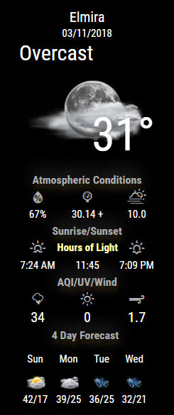
Much slimmer so it takes up less space :) ONLY issue is that as of right now it only works in English…
-
@cowboysdude I like this new style… for german translation, of course i can help and im sure other users would love to help too
-
@tbbear said in MMM-NOAA - Another Weather Module:
im sure other users would love to help too
I don’t want to help him. I’m just jealous! :-)
-
@Mykle1 LOL ha ha ha u are still the champion
-
Well through determination I figured out the issue :)
There will be 2 branches of this module…the original and the one I call NOAA2
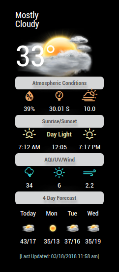
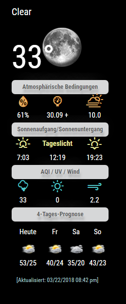
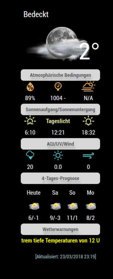
Here’s a screenshot [NOAA2] take up less space, almost ready!!
-
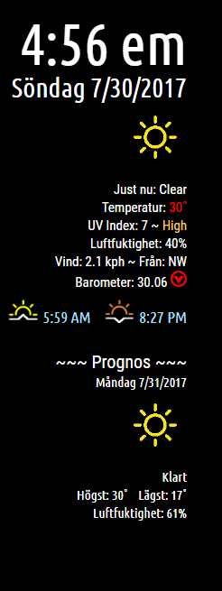
German translation is done :) [The current weather at top is also in German, just didn’t take a new picture ;)]
-
I did not like the old look, but the new one is very nice. Well done!
-

-
@yawns said in MMM-NOAA - Another Weather Module:
I did not like the old look, but the new one is very nice. Well done!
I don’t like that he wrote the most popular module. ;-)
59.1k views!
-
@Mykle1 dont be jealouse my friend, u are still the BEST … ok a little behind him …lol
-
That does not make me feel better! haha ;-)
-
Stay tuned for NOAA3… ;)
-
-
Plans for NOAA3
Include other service providers so users aren’t bound to just wunderground
a. Other services will include dark skies, etc. -
Where can I find NOAA 2?
Peter -
@Peter Hi, its not yet a public version, but stay tuned it will come soon
-
@Peter said in MMM-NOAA - Another Weather Module:
Where can I find NOAA 2?
PeterI just finished all the translation files today :) So people will have to let me know if they are correct LOL
All updated and it’s located here:
-
@tbbear Hey, thumps up for helping to develope this great module to the german language !!!
the reason why I write here are two problems:
1.) My Mirror shows me the English translation instead of the german one. My config.js is set to: language: “de”, I thought the module will pull the german translation file, but everything is in english for now. Do you have any suggestions what´s wrong? if you want, i can post the snippet out of my config.js
2.) The measures are still in Fahrenheit. For me as a german user it would be fine to display the units in Celsius as it is the case on your mirror :-) Maybe when I solve the 1.) problem, the units switch?
I would be very happy to receive your feedback, cheers from Bonn Germany,
Bernd
-
@anubis273 For better analysis here are snippets from my config.js an a screenshot what my mirror is currently show:
snip
language: “de”,
timeFormat: 24,
units: “metric”,
snipsnip
{
disabled: false,
module: ‘MMM-NOAA’,
position: ‘top_right’,
config: {
apiKey: “81944d2065866c80”,
airKey: “your key”,
pws: “INORDRHE796”
}
},
snip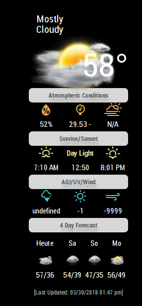
Cheers,
Bernd
-
@anubis273 Hallo du hast alles richtig gemacht nur die falsche Version in meinem github findest du die richtige tbbear/NOAA2
Hello! It looks like you're interested in this conversation, but you don't have an account yet.
Getting fed up of having to scroll through the same posts each visit? When you register for an account, you'll always come back to exactly where you were before, and choose to be notified of new replies (either via email, or push notification). You'll also be able to save bookmarks and upvote posts to show your appreciation to other community members.
With your input, this post could be even better 💗
Register Login