Read the statement by Michael Teeuw here.
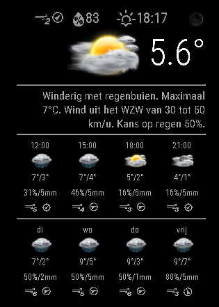
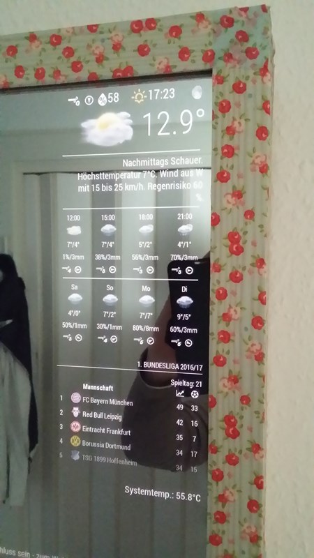
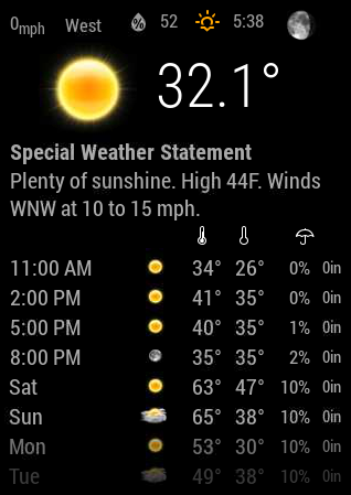
Weatherunderground - currently - hourly - daily - configurable
-
-
This is a stunningly beautiful and informative module and the many config options must make it a favorite of anyone that uses it. I tip my hat to you.
With that, may I make a humble request regarding fctext? I love this option but it can change from 3 lines to as many as 7 lines. Would it be possible to limit, or set, the amount of lines displayed. Or, could the text decrease in size as more information needs to be displayed, taking up the same amount of space?
-
@Mykle1 Hi,
Thank you for your kind words. I’ve now pushed a version that will dynamically scale the fontsize/line length of the forecast text. Give it a go! :D
-
-
Doesn’t seem to happen on my setup…
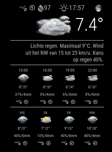
Is your issue that the % sign is on a seperate line?
-
@RedNax no. The lines under and above the forecasttest are not toll the right side of the text.
-
@RedNax said in Weatherunderground - currently - hourly - daily - configurable:
Thank you for your kind words. I’ve now pushed a version that will dynamically scale the fontsize/line length of the forecast text. Give it a go!
I have to run off to work right now but I will “give it a go” as soon as I get home. I’ll let you know. Thanks for this.:thumbsup:
-
@RedNax i can’t say why but now after a while, it looks correct.
-
@ostfilinchen There’s a new version. I left my test in which just used metric. Imperial users wouldn’t be happy. I’ve also added trim to the wordwrap function so here aren’t any trailing spaces
-
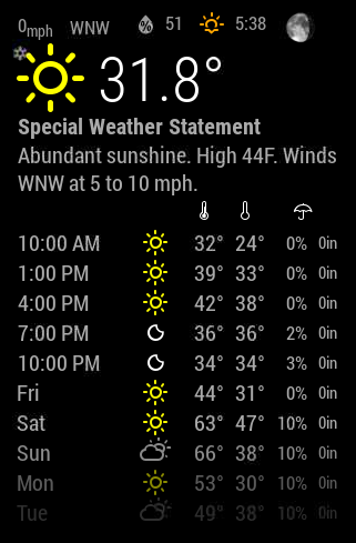
Im still only getting the Icons. How do i get those nicer pictures?
-
@bminer1 Did you try
coloricon: true? -
-
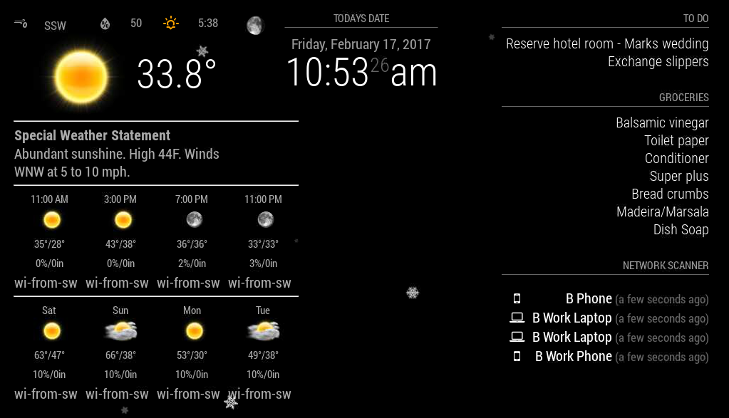
@strawberry-3.141 Im sure you can help me out with something else. The wind direction in the forecast is pushing the module really far into the center of the screen. Is there a way i can change the forecast wind direction to shrink it up a bit? Everything at the top seems to be really far in space. I know i could always go back to the vertical but i like the horizontal too.
-
@bminer1 i think you have another issue, because the text wi-from-sw should actually be an icon
-
@bminer1 Pull the new version ;)
-
@RedNax much better! Thank you!
Just one thing, aesthetically, the little wind icons arent all uniform.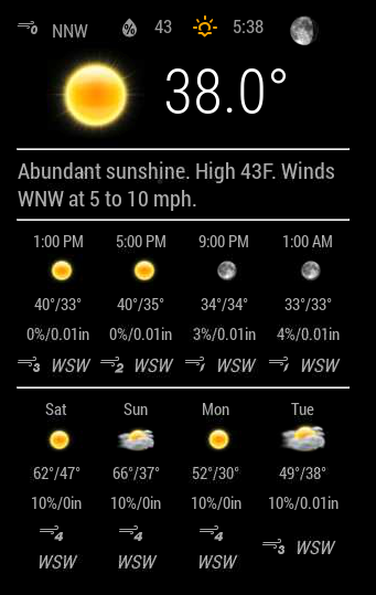
-
@bminer1 Made the fontsize smaller in css.Please try it.
You can try to tweak this is it still behaves oddly.
.MMM-WunderGround .smaller { font-size: 60%; } -
@RedNax After the latest update, the Module wouldn’t start :-(
-
@ostfilinchen Anything in the logs? Works fine here…
IT could be your chosen weatherstation is feeding ‘estimated’ forecasts. The module skips those as they vary wildly (0 to 15 degrees C)… Should clear up on it’s own in that case.
Update: There was no logging on skipping estimated forecasts. Added it just now.
-
@RedNax in dev Mode it says: uncaught TypeError: cannot read property ‘cloudy’ of undefined. MMM-WunderGround.js Line 877
Hello! It looks like you're interested in this conversation, but you don't have an account yet.
Getting fed up of having to scroll through the same posts each visit? When you register for an account, you'll always come back to exactly where you were before, and choose to be notified of new replies (either via email, or push notification). You'll also be able to save bookmarks and upvote posts to show your appreciation to other community members.
With your input, this post could be even better 💗
Register Login